Project Goal
Design and deliver 6 mid-fidelity wireframes that improve CRM flows that pharmaceutical sales reps move through repeatedly and are consistently frustrated by
The Deliverable
Decide upon 6 screens from user research and deliver an improved mid-fidelity experience to be developed at a later date
Decide upon 6 screens from user research and deliver an improved mid-fidelity experience to be developed at a later date
The Users
Sales Representatives and Medical Liaison
Sales Representatives and Medical Liaison
Project Details
Team (5): UX designer, UI designer, Project manager, Tech lead, Design lead
Role: UX designer (and researcher)
Timeline: 3 months
Main tools: Airtable, Figma, Figjam
Team (5): UX designer, UI designer, Project manager, Tech lead, Design lead
Role: UX designer (and researcher)
Timeline: 3 months
Main tools: Airtable, Figma, Figjam
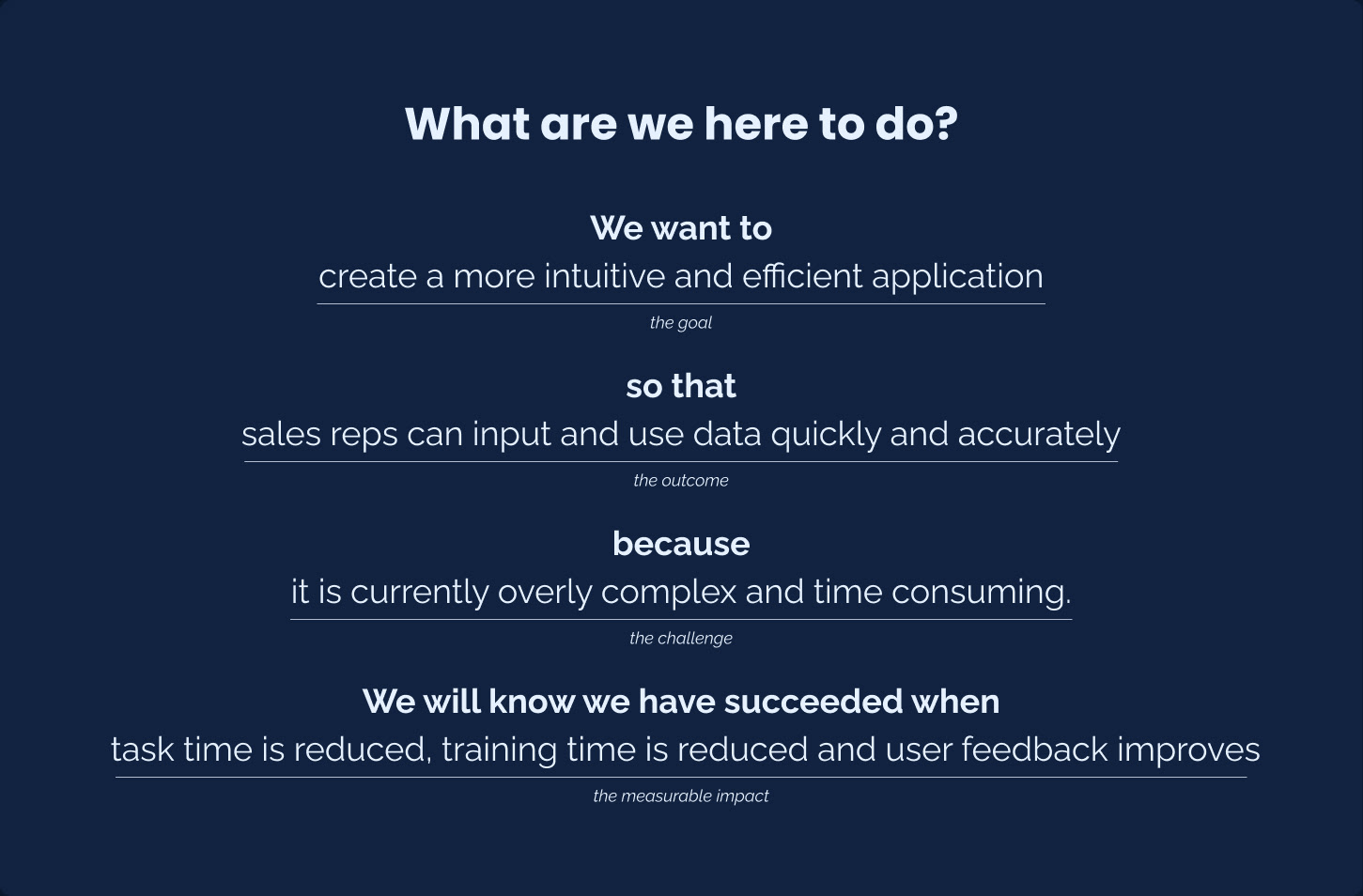
Discovery Goal
Better understand the vision from the stakeholders to optimize the mid-fidelity designs and develop a comprehensive understanding of the sales reps experiences with their CRM.
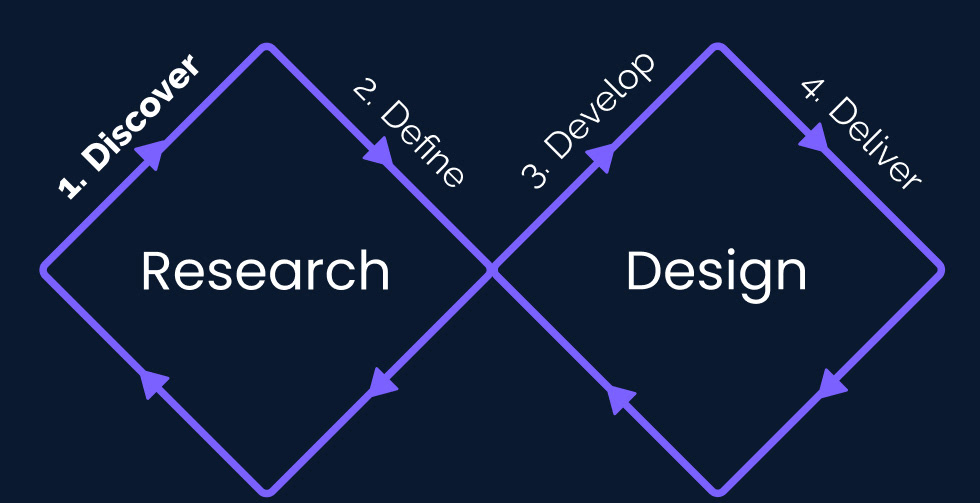
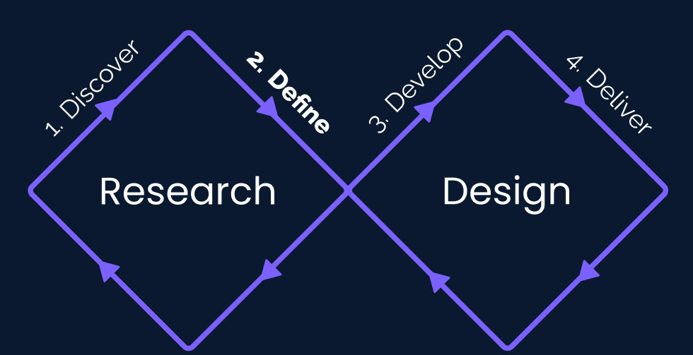
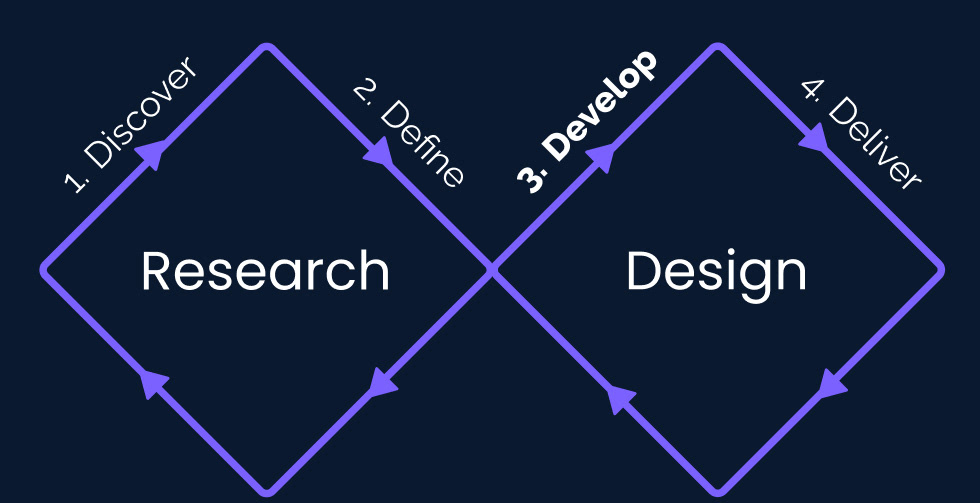
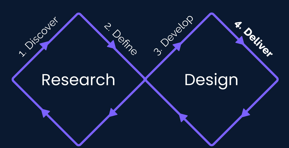
Overarching Process
Generate stakeholder alignment to create a sense of accountability
Gather insights into the CRM and sales rep experience with varying research methods (heuristic evaluation, interviews and focus groups)
The purpose statement created by stakeholders
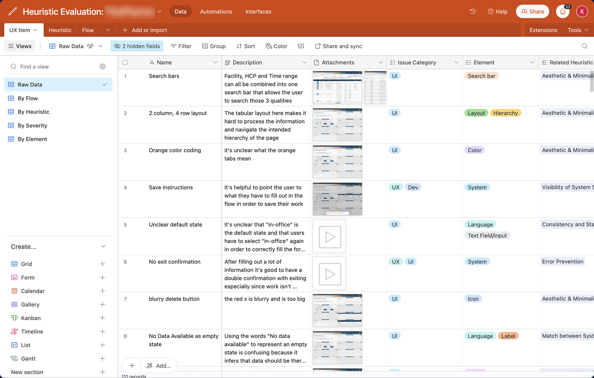
Heuristic Evaluation in Airtable
Evaluation for a specific flow
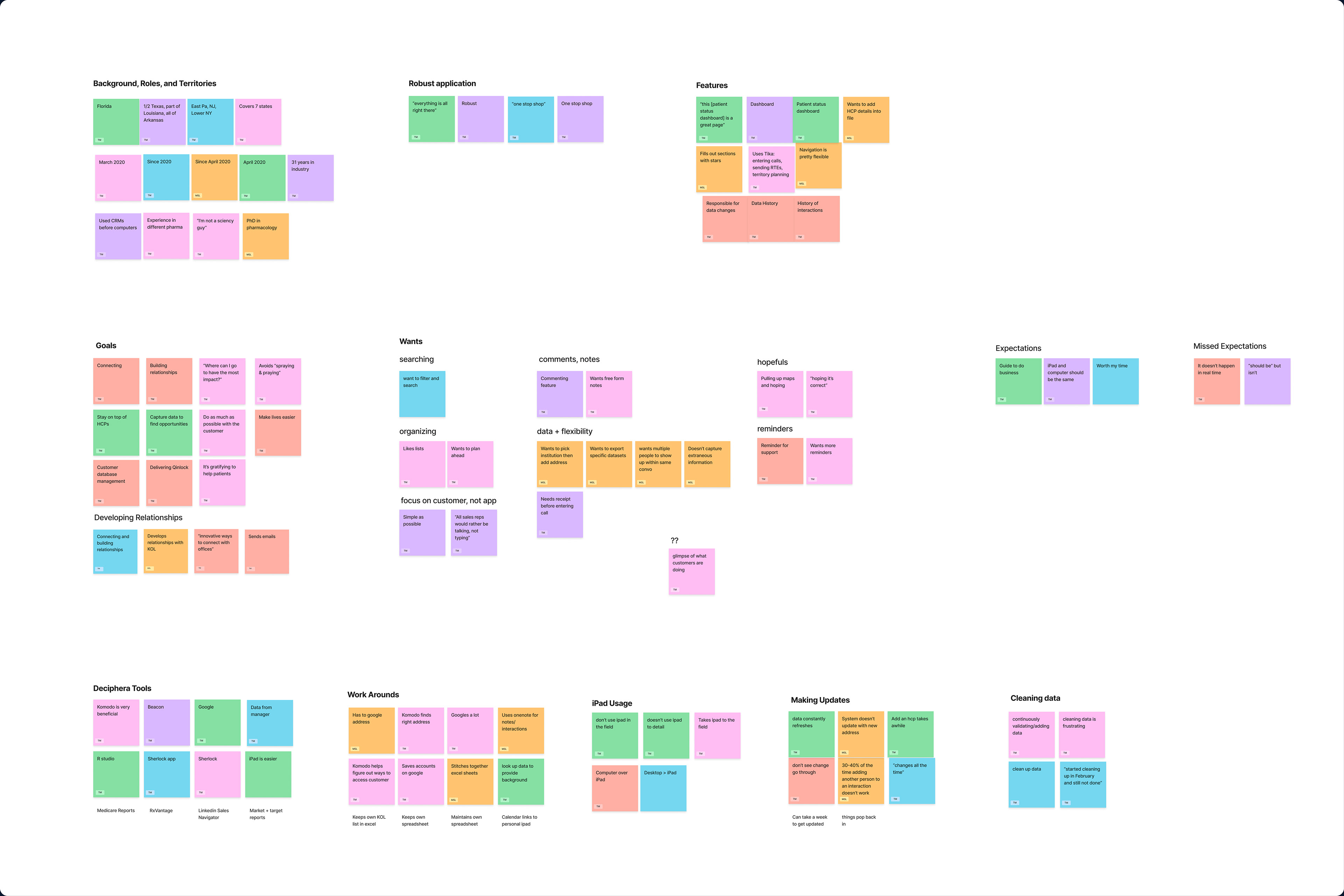
Interviews
Participants: 5 Sales Reps and 1 Medical Science Liaison
Time: 1 hour over zoom
Goal
Develop an comprehensive understanding of behavior and needs by crafting questions around the day-to-day experience and leading a walkthrough activity
Develop an comprehensive understanding of behavior and needs by crafting questions around the day-to-day experience and leading a walkthrough activity
Assumptions
Participants would likely talk about the challenges of navigating the interface and mention the use of workarounds to compensate.
Participants would likely talk about the challenges of navigating the interface and mention the use of workarounds to compensate.
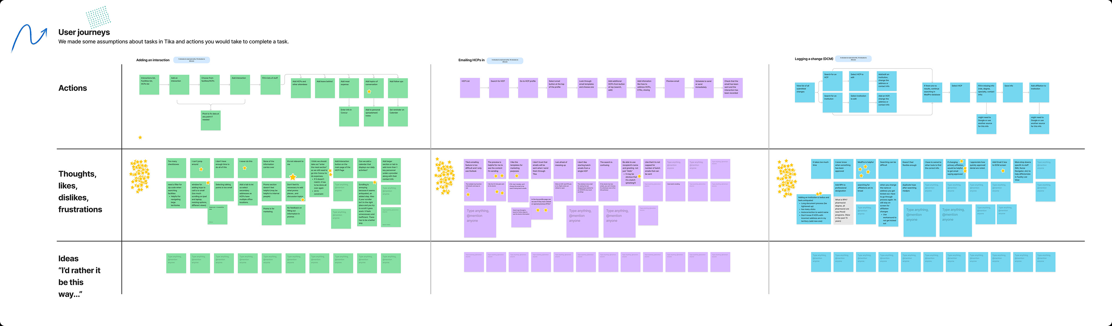
Focus group snapshot
Focus Groups
Participants: 3 focus groups divided by company role
Time: 1 hour over zoom
Goal
Generate group discussion around likes, dislikes and thoughts specifically within the 3 primary flows using the consistent activities.
Generate group discussion around likes, dislikes and thoughts specifically within the 3 primary flows using the consistent activities.
Assumptions
Focus groups would likely validate the interviews.
Focus groups would likely validate the interviews.
Define Goal
Synthesize learnings from research with a careful intention to cross-analyze themes between varying research methods.
Overarching Process
Gather and organize data points from each research method
Generate overarching themes with a defined problem to focus on for the design
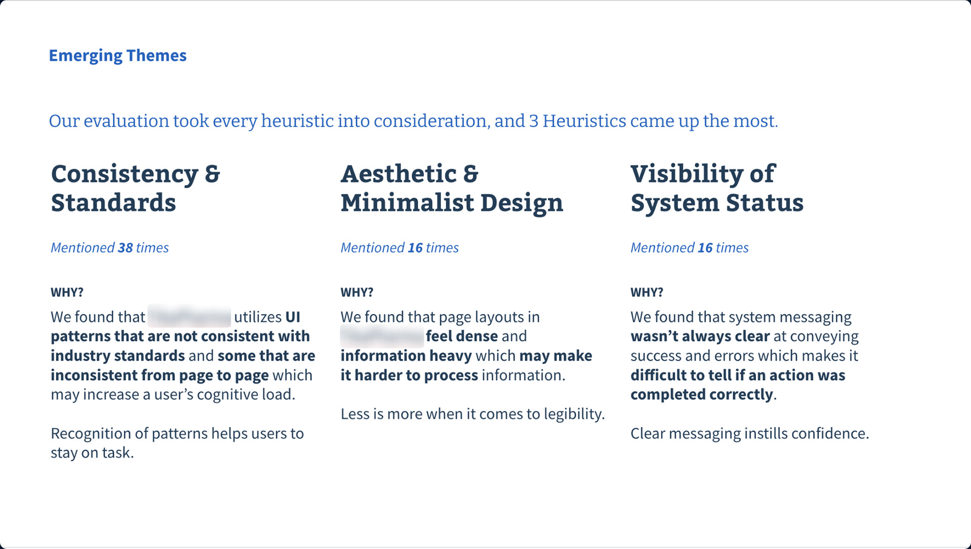
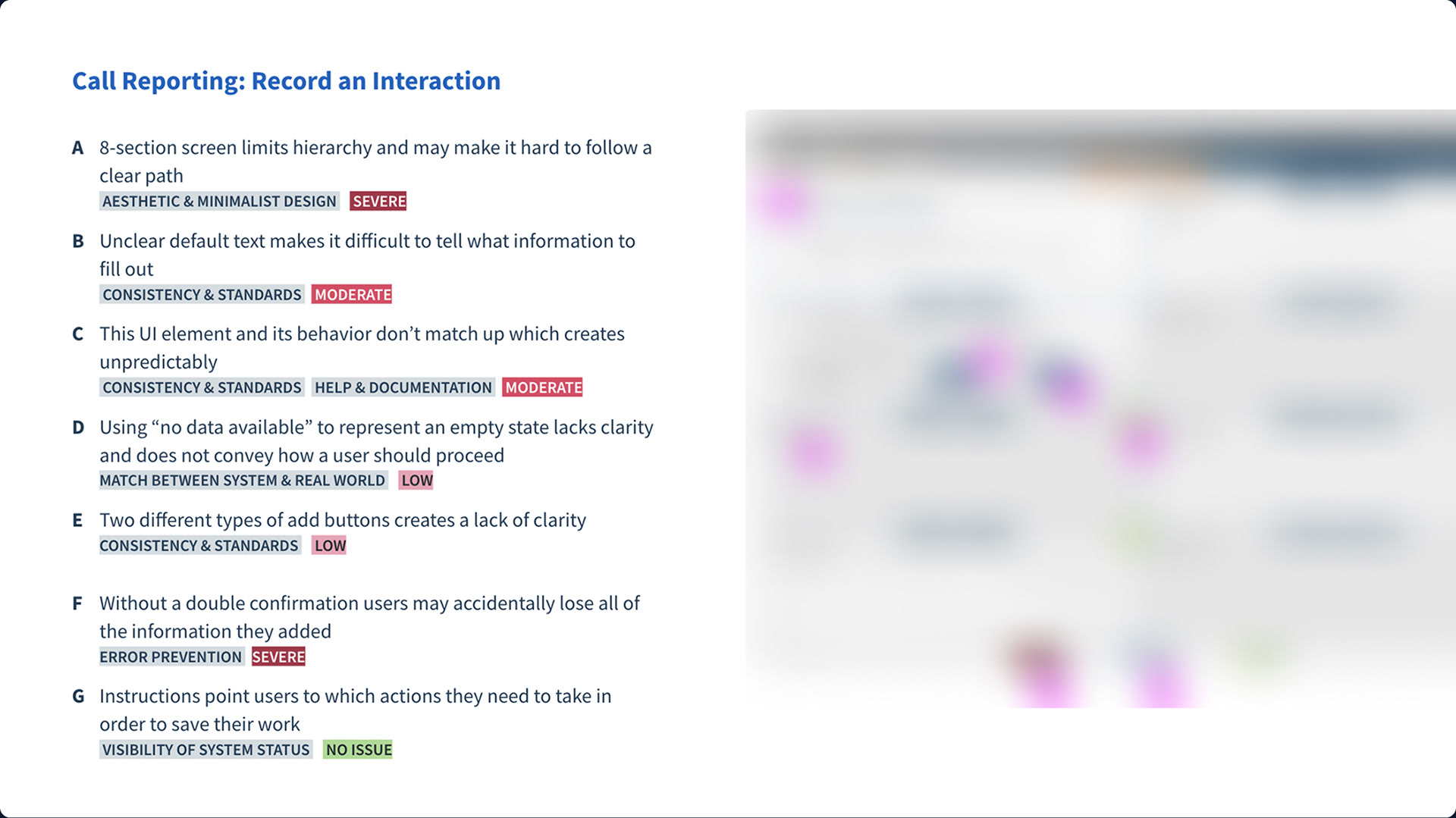
Themes from the Heuristic Evaluation
Affinity map from focus group and interviews
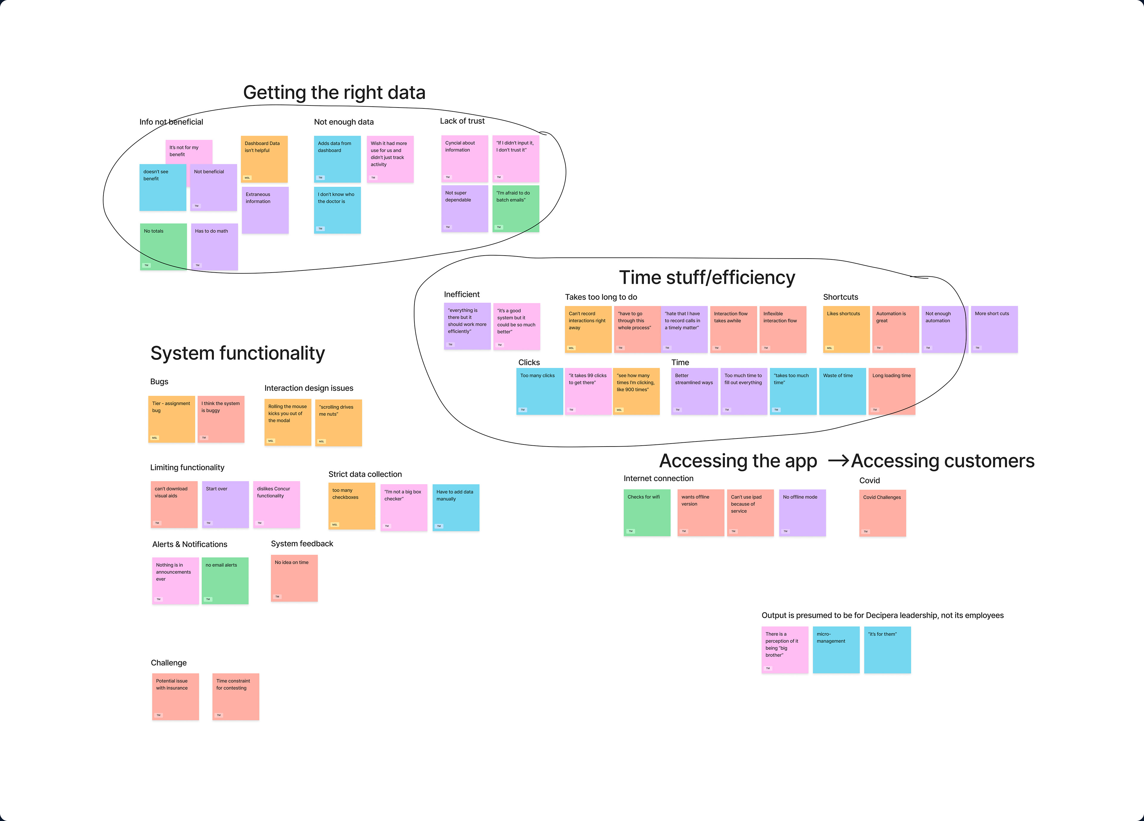
Affinity map of pain points from focus groups and interviews
The Problem
The sales team was spending less time in the field and spending more time figuring out workarounds for an unintuitive experience (like tracking touchpoints in Excel). They were lost in the architecture and clearly noted a mistrust in the data because it felt obscure and outdated.
Develop Goal
Reduce the need for workarounds by increasing the speed of data input and adding in tools for analytics and time management. Improve data integrity by creating a more predictable and transparent experience.
Overarching Process
Research competitors to examine alternative flows and structures
Wireframe initial ideas for 6 screens to brainstorm improvements
Validate Designs with sales reps
Designs
Competitive Research
Researching other CRMS in the market gave us an idea about what layout felt intuitive, standard features and what potential enhancements we could add to increase competitive advantage for the product.
Researching other CRMS in the market gave us an idea about what layout felt intuitive, standard features and what potential enhancements we could add to increase competitive advantage for the product.
Wireframe Brainstorms
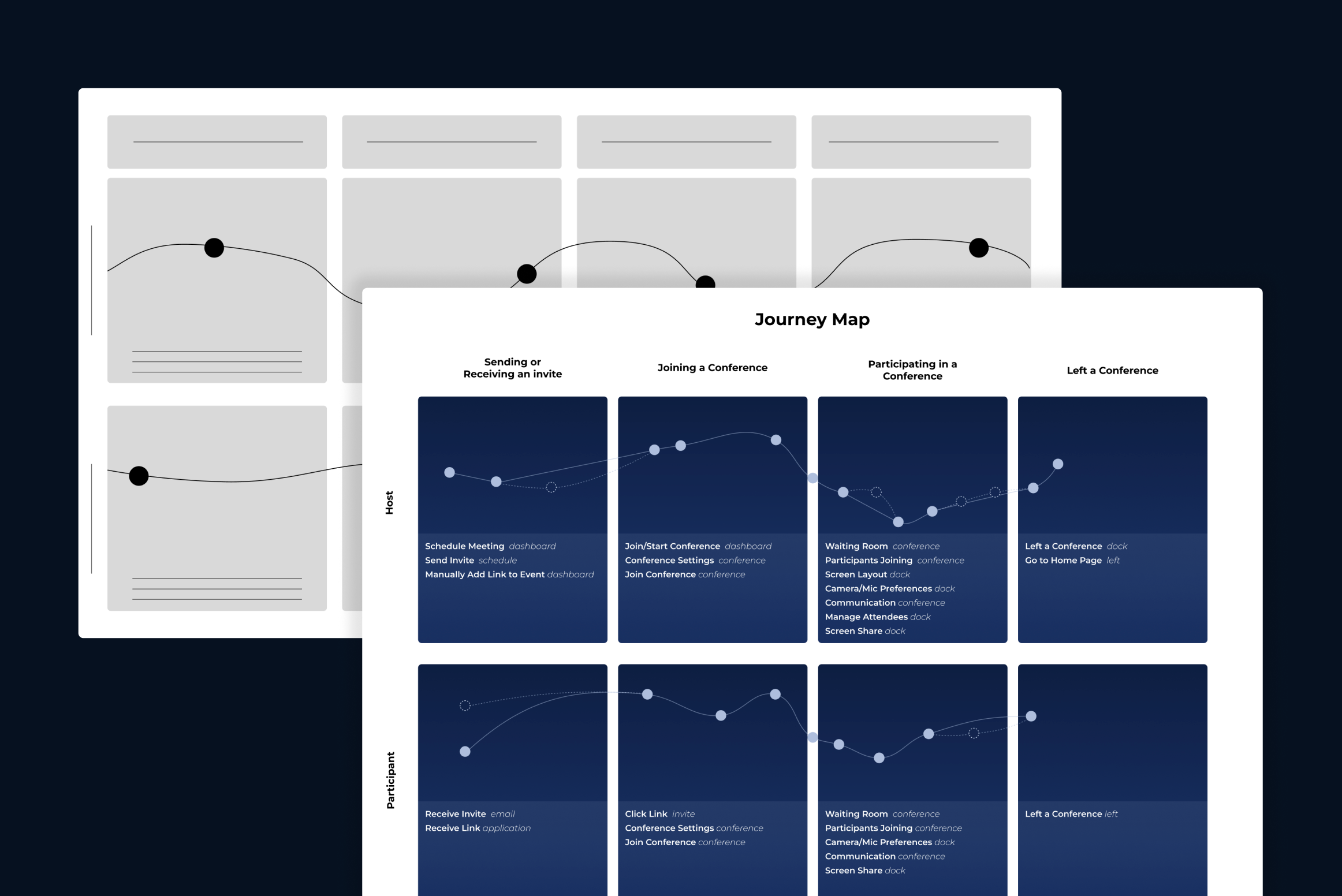
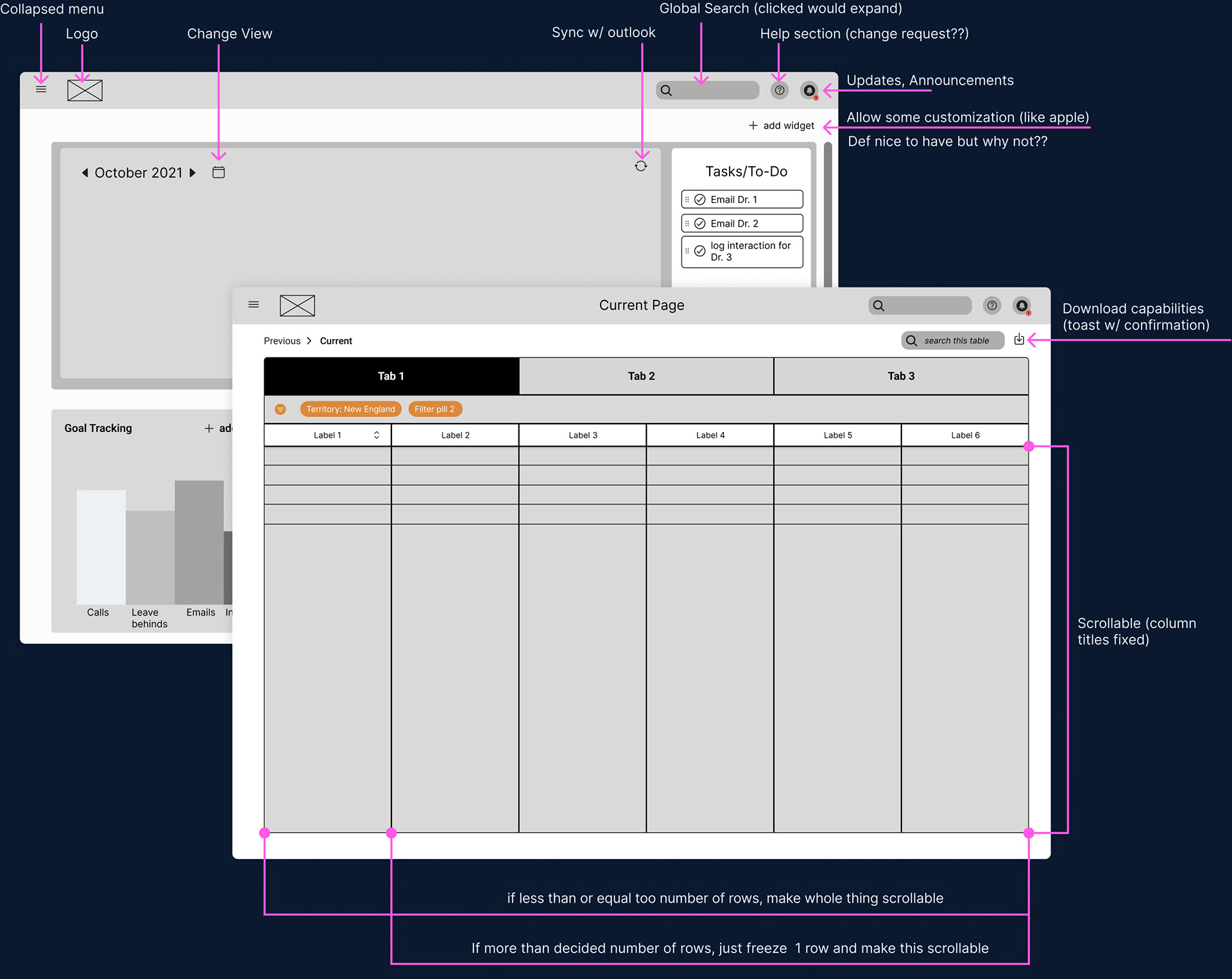
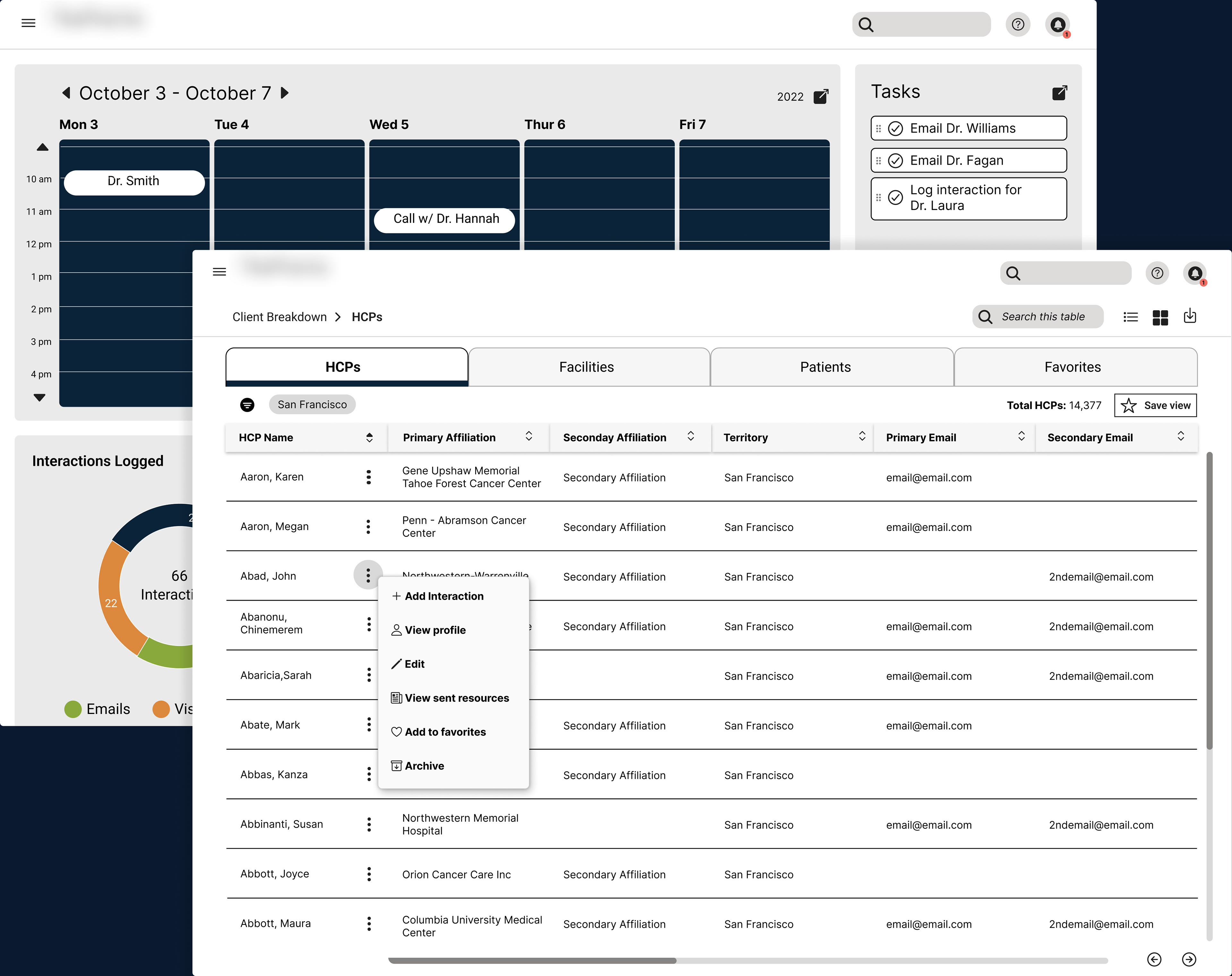
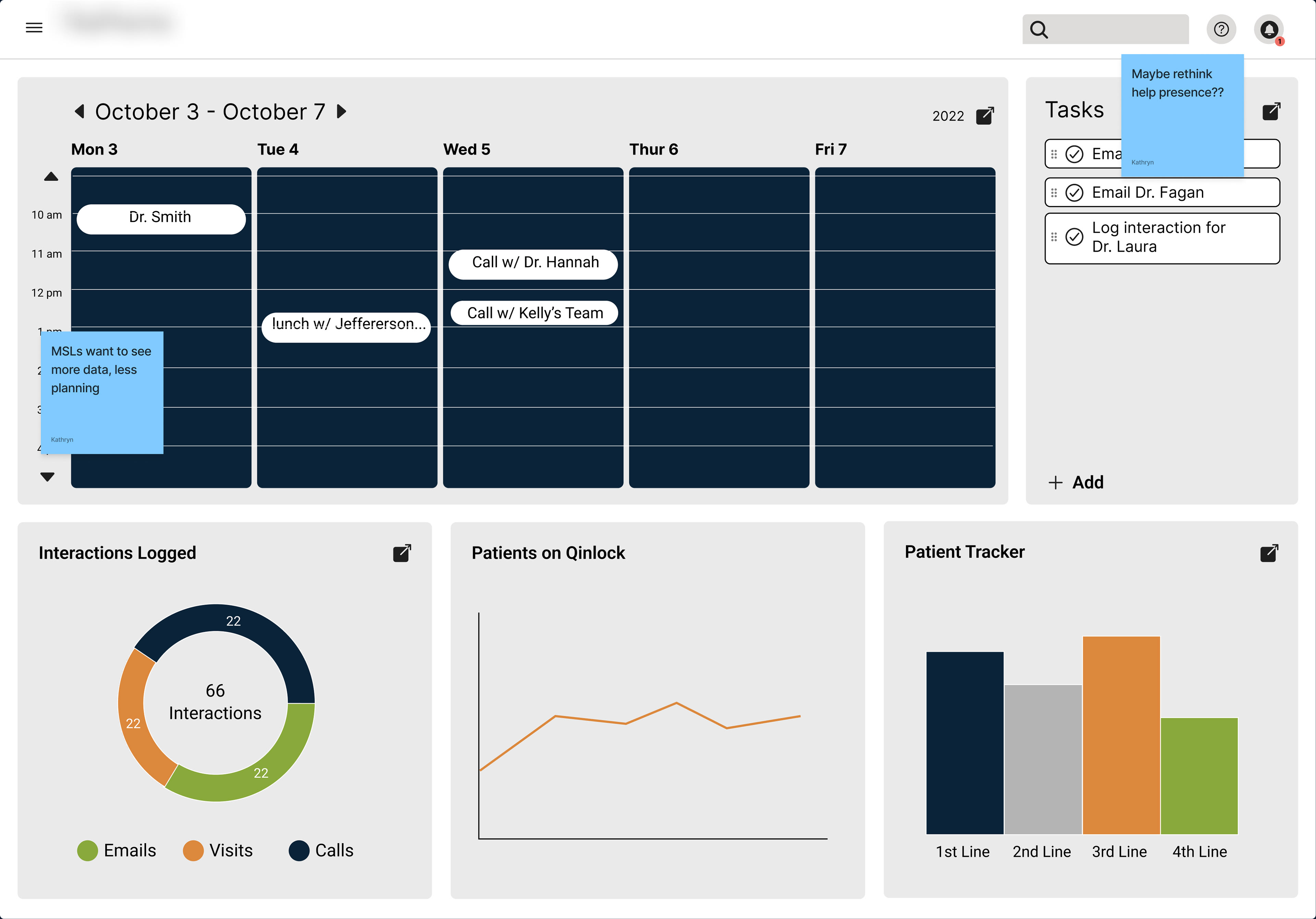
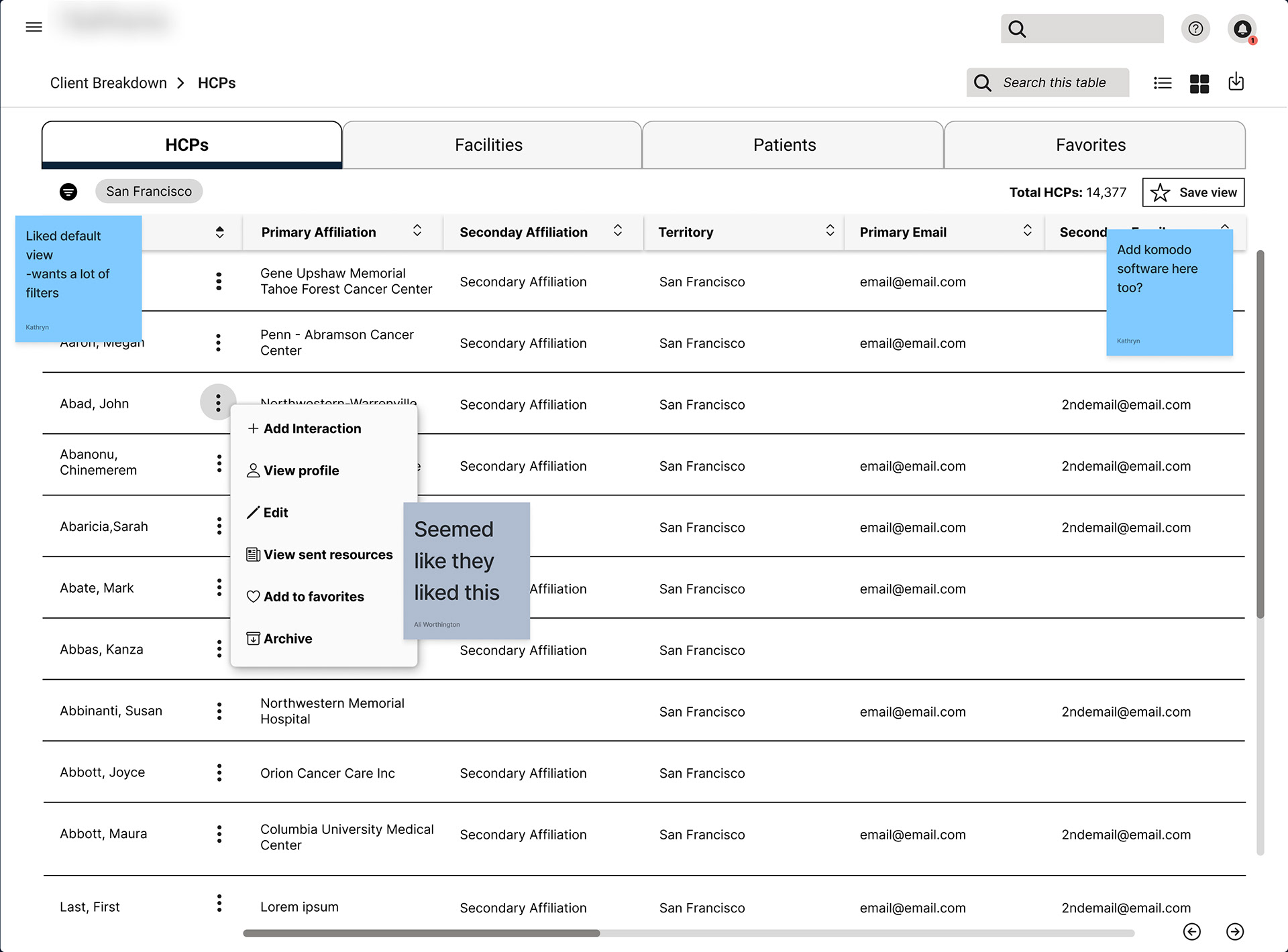
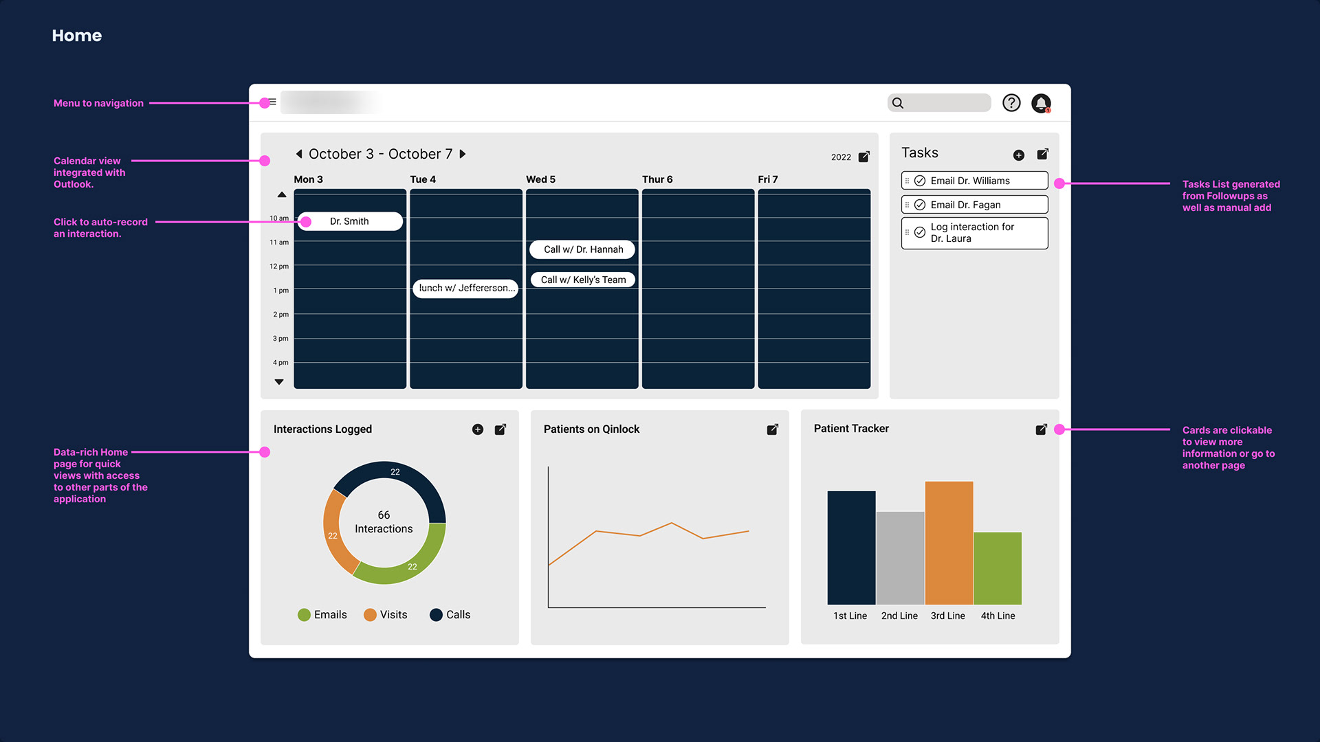
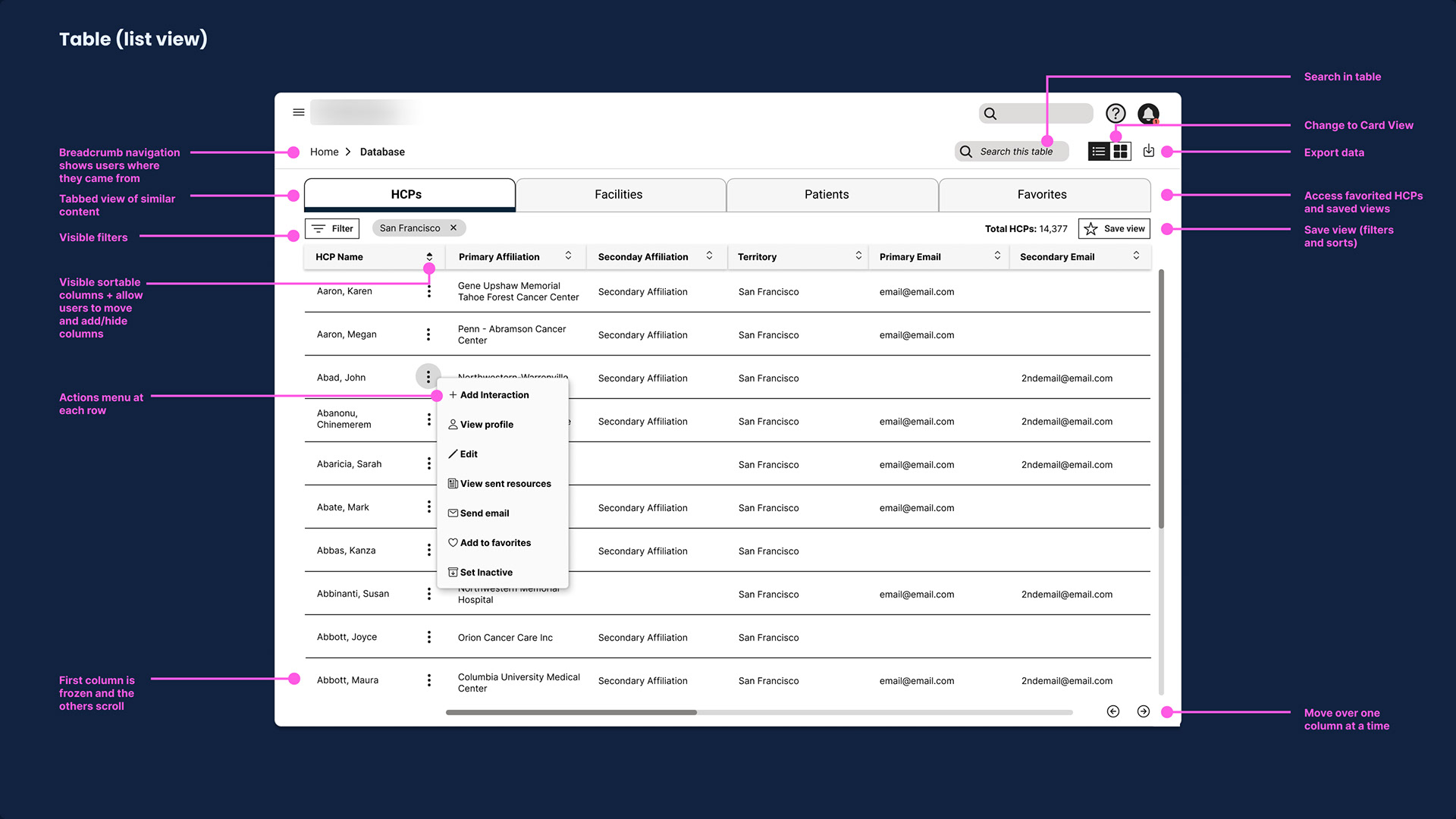
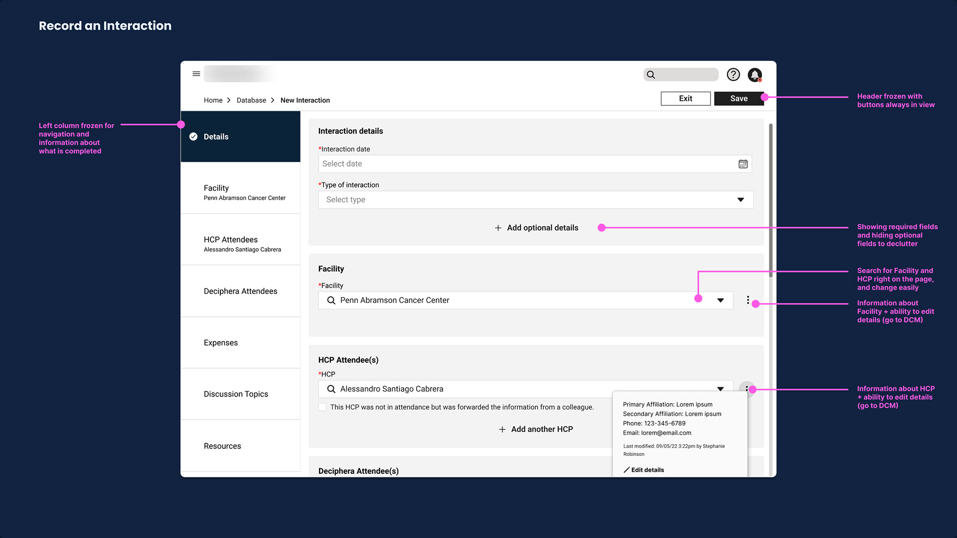
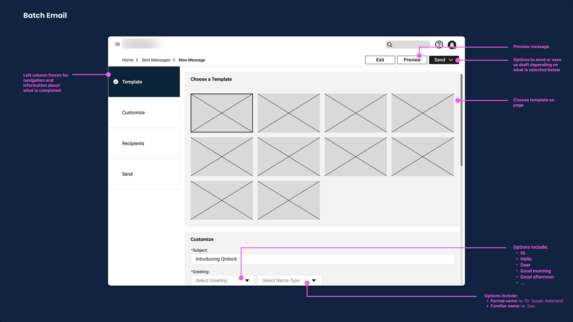
For each of the 6 screens, we standardized each layout and made the flows more predictable. To increase analytics and transparency we added in detailed metrics surrounding data like what was added when and who added it.
For each of the 6 screens, we standardized each layout and made the flows more predictable. To increase analytics and transparency we added in detailed metrics surrounding data like what was added when and who added it.
Design Validation
Participants: 5 Sales Reps and 1 Medical Science Liaison
Time: 1 hour over zoom
Goal
Validate that designs felt intuitive, efficient and analytical. Ensure that any additional enhancements felt necessary and everything was easily navigable and built trust.
Validate that designs felt intuitive, efficient and analytical. Ensure that any additional enhancements felt necessary and everything was easily navigable and built trust.
Assumptions
Added predictability and increased functionality would be appreciated. Some metric UI would be off.
Added predictability and increased functionality would be appreciated. Some metric UI would be off.
Design Validation Results
Pros
Participants loved the standardization around navigation and layout specifically the breadcrumbs and clear IA. They appreciated how they could interact with the data, the different analytics and how the experience felt more predictable.
Cons
Some language needed to be updated and different groups had different preferences on what they saw on the dashboard which sparked widget customization as a future enhancement.
Deliver Goal
Deliver the 6 mid-fidelity screens with documentation on functionality that was backed by the completed research.
Overarching Process
Clearly call out the elements in each screen backed by data
Generate recommendations for future work


Recommendations
Create and maintain a design library to maintain consistency and improve system understanding, Research tech integration possibilities to streamline the experience and further decrease the need for workarounds. Finally, further research should be done to explore what types of content sales representatives want displayed and metrics can be added for each user group.

Reflections & Challenges
Optimize Roadmap for User Groups
We ended up only being able to cater our designs using the data from the sales reps. In hindsight, if we reorganized the roadmap into two main parts focusing on research and design for both user groups we would have been able to deliver empirically based work for everyone.
We ended up only being able to cater our designs using the data from the sales reps. In hindsight, if we reorganized the roadmap into two main parts focusing on research and design for both user groups we would have been able to deliver empirically based work for everyone.
Designing without a Design System
We had to deliver 6 wireframes to an offshore development team without an established design system which meant that there was great risk in re-creating inconsistent UI. It would've have been useful to spend some time in the beginning developing a minimal design library for the development team to draw on to help them build a stable experience.
We had to deliver 6 wireframes to an offshore development team without an established design system which meant that there was great risk in re-creating inconsistent UI. It would've have been useful to spend some time in the beginning developing a minimal design library for the development team to draw on to help them build a stable experience.