Sun Crest Bank is a financial institution that has a particularly strong relationship with Millennials. Their goal was to expand out of the Millennial demographic into the Gen-Z population by teaching responsible money management techniques and strengthening financial literacy skills.
Our challenge was to design a digital banking experience to help Sun Crest reach Gen-Zs without weakening relationships with Millennials and older adults. It needed to have a proper balance where customers felt educated and not belittled in addition to providing banking resources that people actually needed and would use.
Time Frame: 2 Weeks
My Role: UX Researcher and Designer
The Team: 2

First things first
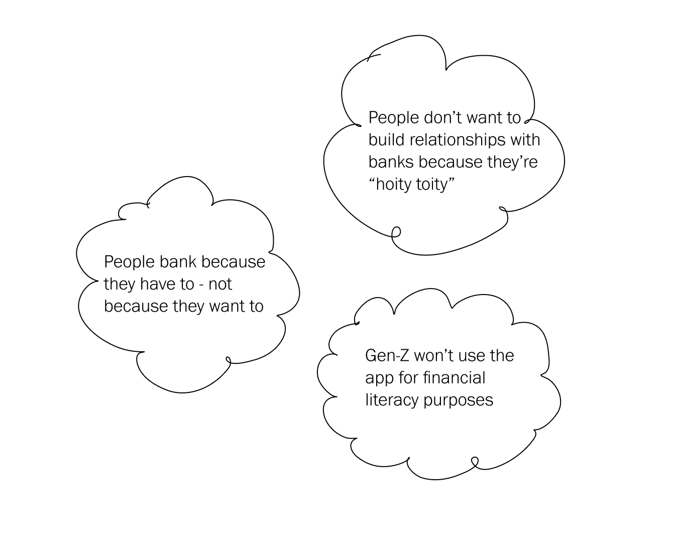
I like to mediate and address any underlying implicit biases or assumptions I have on a subject. This helps me compartmentalize my own prejudices and separate it from the data.
The end result is research - totally free from confirmation bias - and based in open-minded curiosity.
Some of my preconceived notions...
I also asked the team to meditate
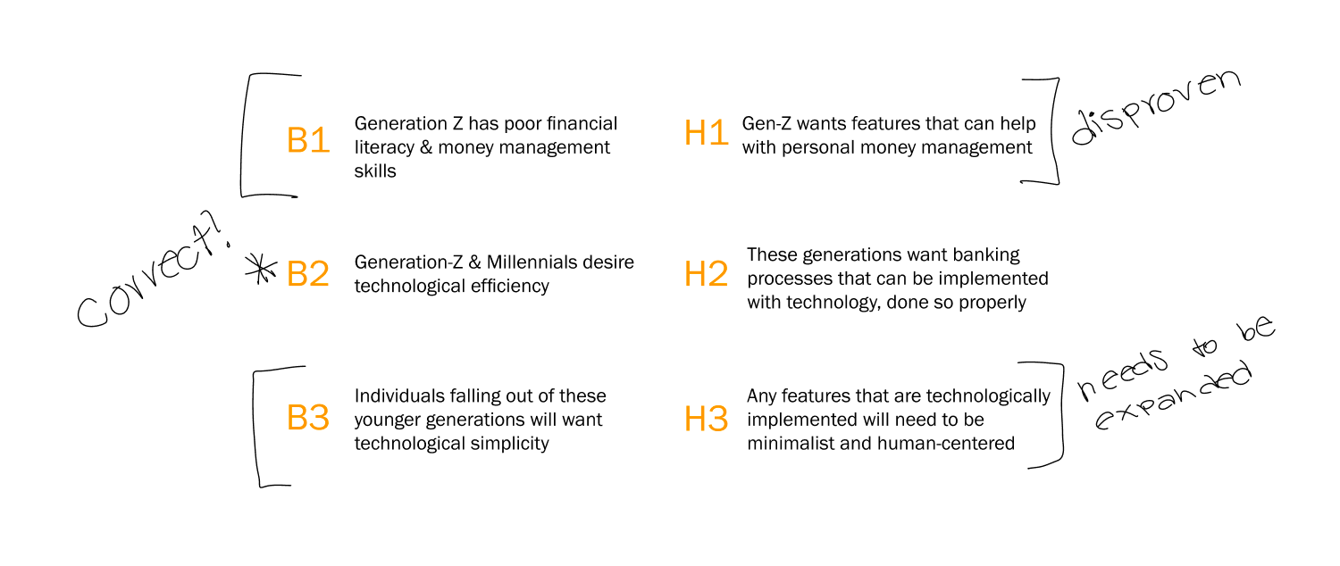
We discussed some biases that the team held and then extrapolated hypotheses. We ended up with three main ones that we aimed to either validate or disprove with the research.
This helped give me a broad idea of what the team was expecting from the research so we could monitor our mindset before jumping into the ideation process.
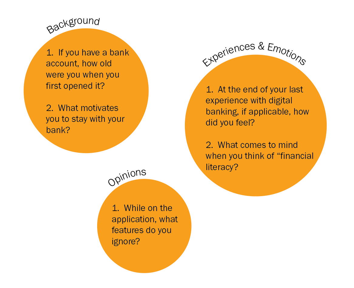
And then I created surveys
Typically I don't like to conduct surveys because I find that they provide stagnant and incomplete data. However, due to the time constraints, I utilized surveys because they can yield large data sets in a short period of time.
With this in mind, I structured my surveys in a format that would prompt for a specific experience, push for emotional responses to that experience and then challenge the user to pin point the reason behind that emotional reaction. My hope was that this structure would compensate for some of the survey's weaknesses. I was not disappointed and I learned a lot.
______________
Goal: collect foundational data on people's experiences with digital banking and financial literacy as well as any their respective emotions
Responses: 25
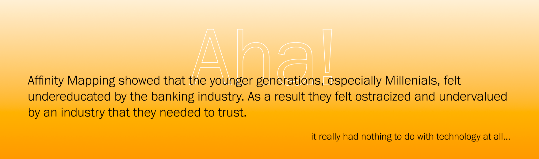
After, I Affinity Mapped
Since Sun Crest was specifically focusing on younger generations, I approached affinity mapping from the generational perspective. Using excel, I synthesized the data on a generational base and searched for keywords and concepts for each question.
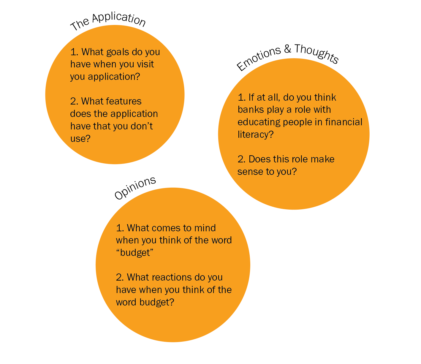
And then went back and conducted formal interviews
Ideally I would've loved to interview a minimum of five users but due to time shortages I was only able to interview two. I specifically chose to interview one in each of the younger generations to get some more qualitative data specific to each one.
Their insights strengthened my "aha" moment and deepened my understanding of how people internalized the lack of education within the industry.
___________
Goal: to better understand the reason behind the emotional reactions to "financial literacy" and the industry as a whole within a generational context
Interviews: 2
Average Length: 24 Minutes
And Affinity Mapped again
This time when affinity mapping I categorized based on overarching themes. Not only did I feel confident that my "aha" moment was accurate but I learned much more about specific expectations and the impact on users when banks fail to meet them.
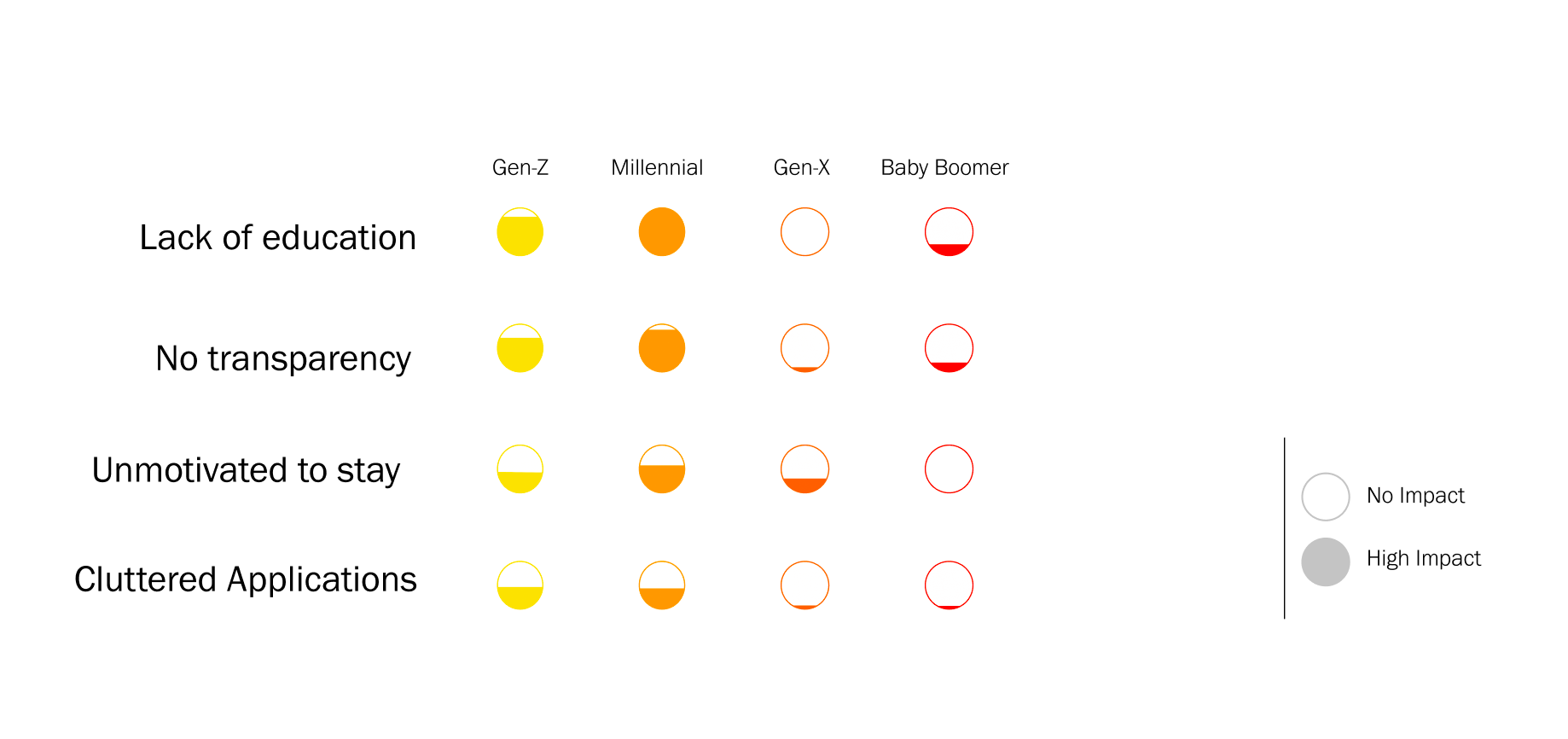
All of this data led me to the following paint points, organized by generation as each one had different reactions overall. As you look at this graph, keep in mind that the level of frustration is meant to be compared within the context of the generation, as each generation voiced their frustration differently... For instance, Gen-Zs were very aware of the problems but were much less frustrated by them as Millennials were.
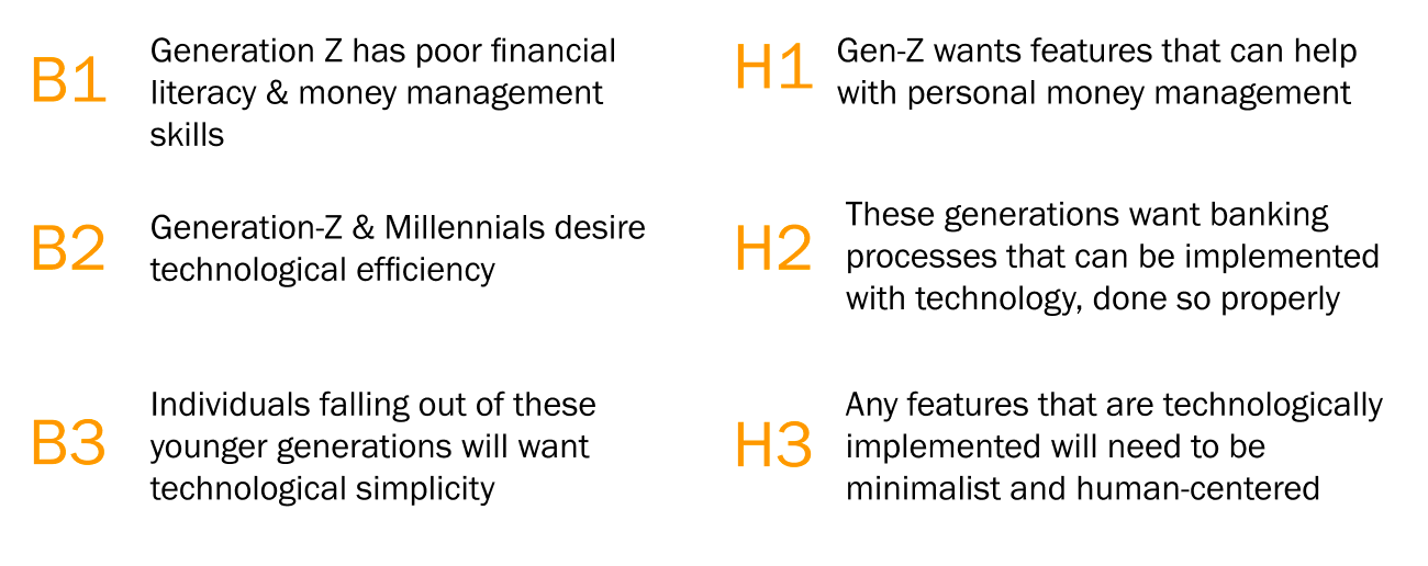
Finally, we adjusted our hypotheses accordingly
It came as no surprise that people didn't use a majority of the features available. In addition, previous external research showed that only 4% of users in 2018 switched banks. So, even though users weren't motivated to stay, they didn't want to put in the time required to switch banks.
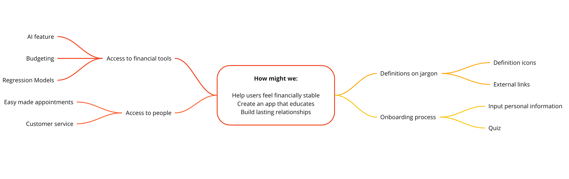
With knowledge of the problem, we then then created how might we statements
As a team, we all brainstormed how might we statements and used our top three favorites as main focus points. From there we brainstormed a potential feature list and capitalized on it as a starting point for ideation
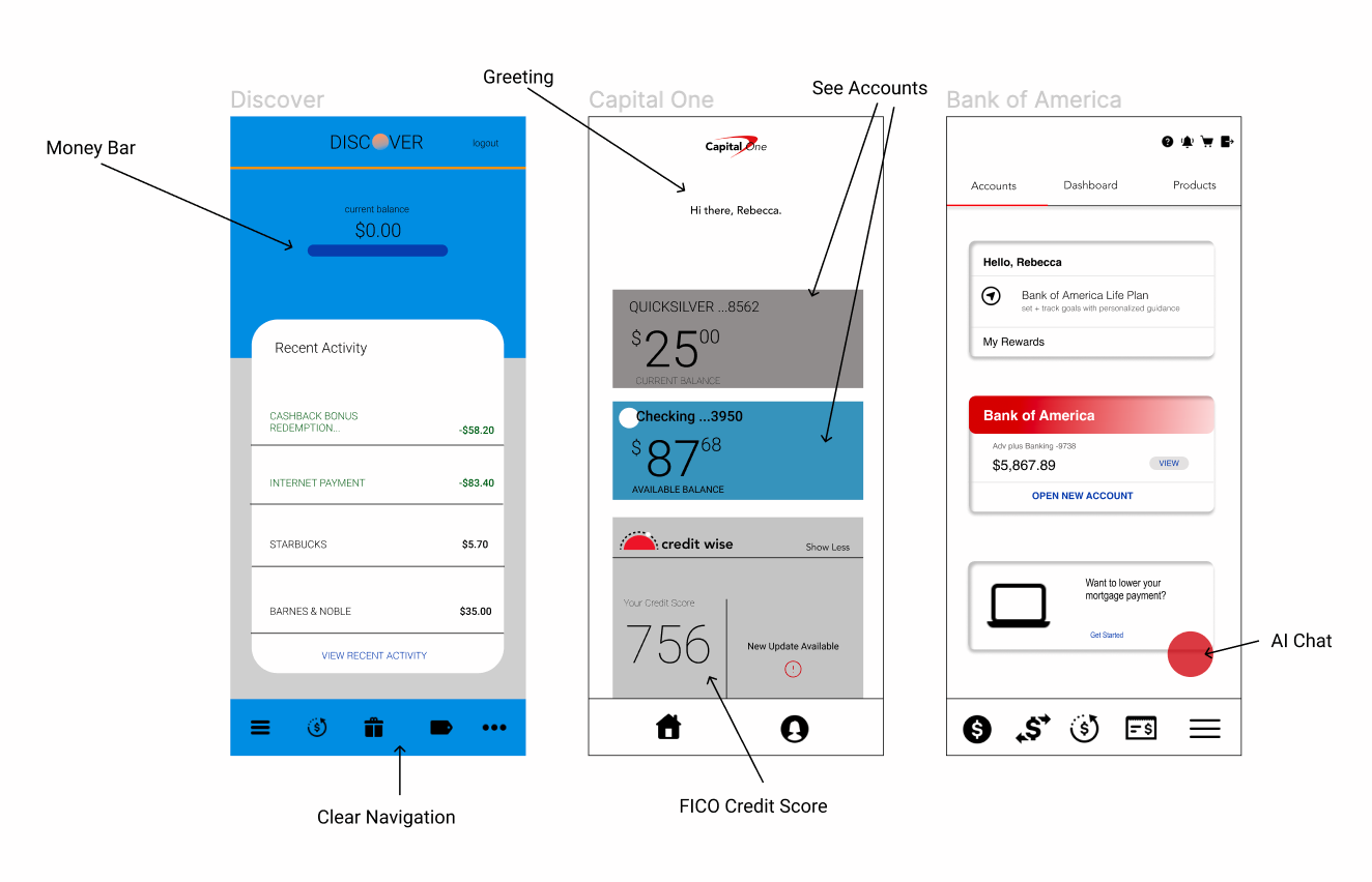
Before designing, I created an app comparison
I specifically looked for features that were centered around human relationships, improved transparency and helped to educate. This analyses supplemented our proposed features list by validating and strengthening our ideas.
And created some wireflows
I focused mostly on layout expecting to update the design moving into higher fidelity prototyping. User testing showed that we needed to clarify sign in language, make the appointment frame bigger and improve the quiz.
After user-testing on the greyscale, we implemented 3 key changes
We were able to have user testing throughout the process but the feedback specific to the mid-fi was the most helpful. During this prototype, users felt like the sign-in language was unclear, the appointment frame was too small and the quiz wasn't as effective as it could be. They weren't used to seeing a temporary username and thought that the app should be better customized to their education level.
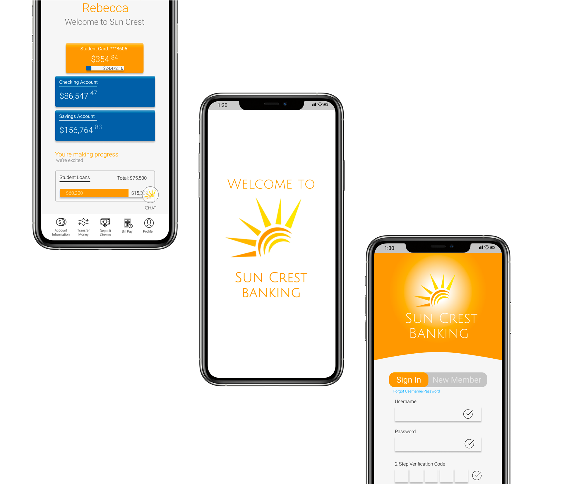
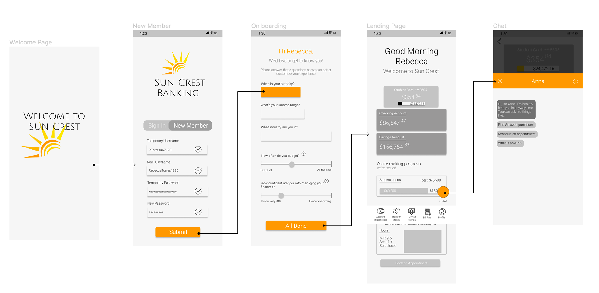
After adjusting for these changes, we created the hi-fidelity prototype
Some next steps: revisiting the data...
Time was a big challenge for us as we struggled to move forward at a pace that was productive yet back in research. I would love to revisit this data and conduct further interviews especially within the Millennial Generation. After this project was completed, I found my self asking whether or not this bank was really addressing the generation that they actually needed to. While Gen-Zs were definitely aware of the lack of education, they were much less frustrated by it when compared to Millennials.
A lack of time also meant that we weren't able to conduct as much user testing as I would have liked to. Therefore, I would like to take our design and conduct some A/B testing to see how user's respond and what those nuances would look like.
There were challenges...
Check out these maps to see the challenges our team faced and how we dealt with them
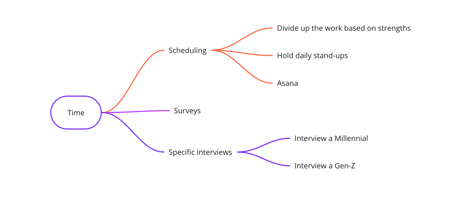
Time
As mentioned, time was a big challenge for us. We ended up spending a large chunk of time in the beginning just planning out scheduling and dividing up tasks. We would hold daily stand-ups to check in with each other and utilized Asana as a resource. Since I was also in charge of the research, I utilized surveys to get a large breadth of data in a short period of time and was deliberate with who I interviewed making sure to talk to at least 1 millennial and 1 Gen-Z.
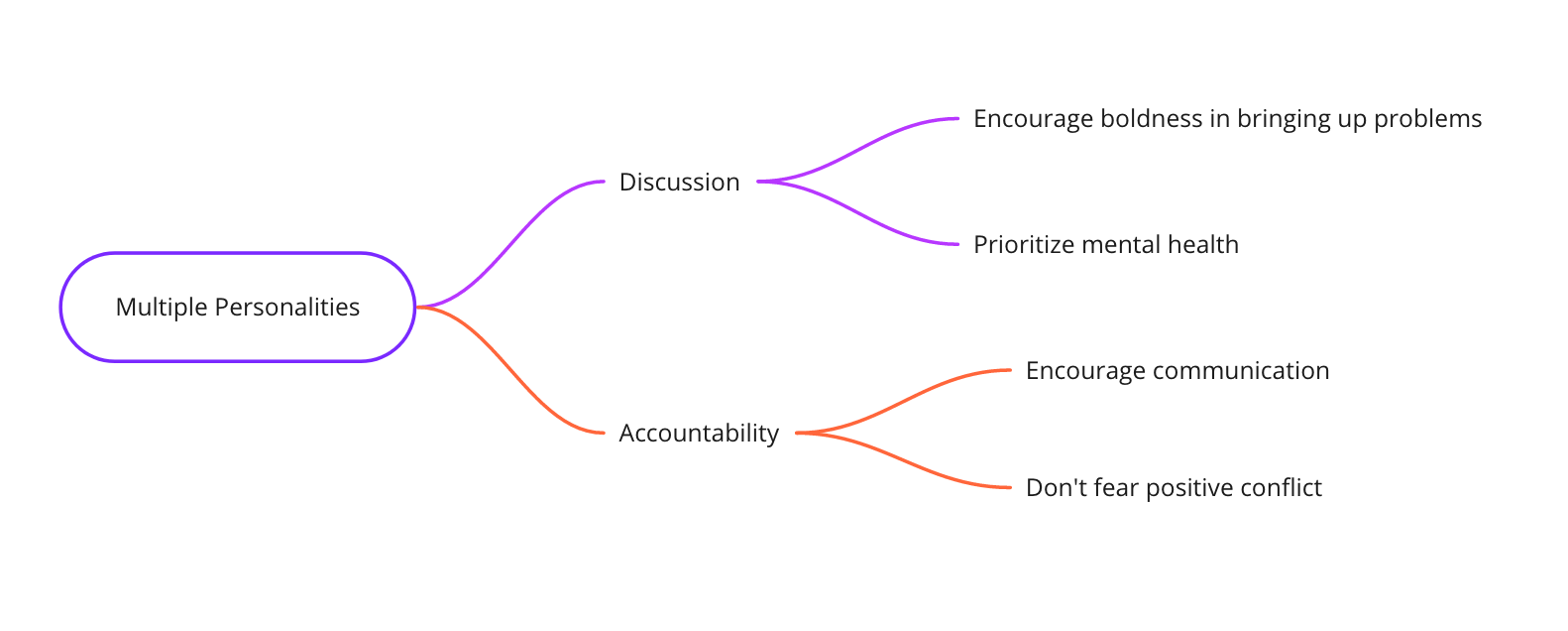
Multiple Personalities
Our team of 3 was really spread into different demographics with an age range from 18-34. This meant that we, as a team, had to empathize with one another since we were in different life stages and we're dealing with a variety of different responsibilities. To encourage this empathy, we hosted discussions where we were deliberate in creating a safe space and protecting mental health above all else. We were also very reliant on accountability for one another. We communicated and brought up positive conflict to make sure that we followed our strict schedule without sacrificing relationships in the process.
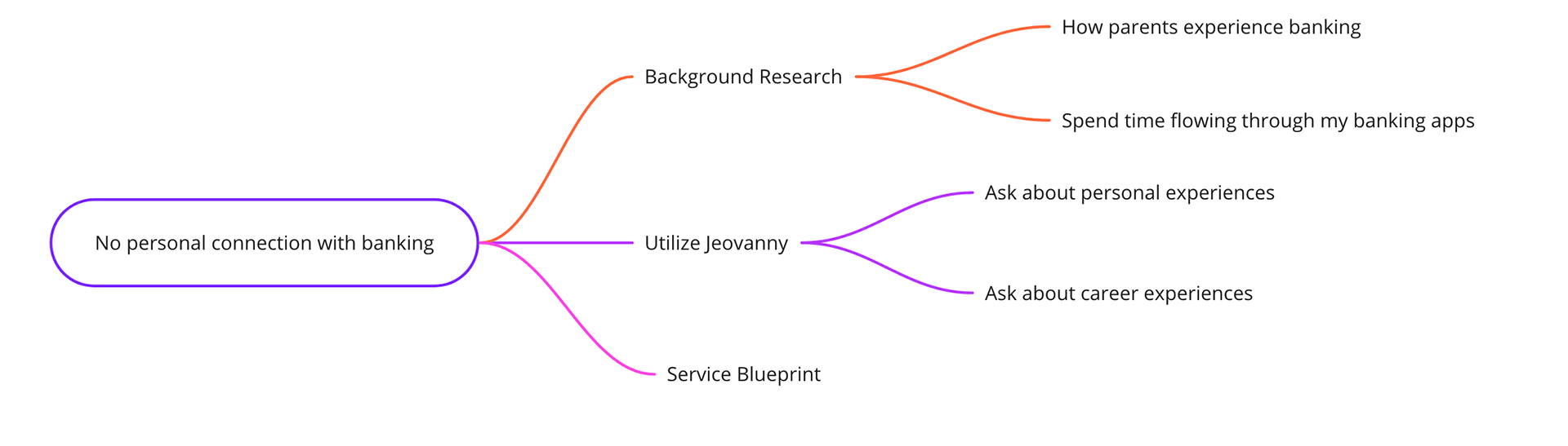
Lack of Understanding
Since 2/3 of us are under 25, we really had no clue what the banking experience was like prior to applications. This meant that we didn't really understand the in-person experience and therefore, couldn't create a seamless transition from in-person to online. To deal with this, Des and I did some background research to figure out what it really was like to rely on physical banks. We looked towards our parents and then compared their descriptions with our banking applications to search for similarities. To complement this background research, we relied heavily on Jeovanny since he understood what the experience was like prior to applications and had experience as a bank teller. He helped communicate the process to us by designing a service blueprint and walking us through that process.