Project Goal
Redesign a registration experience for a portal that balances simplicity with security
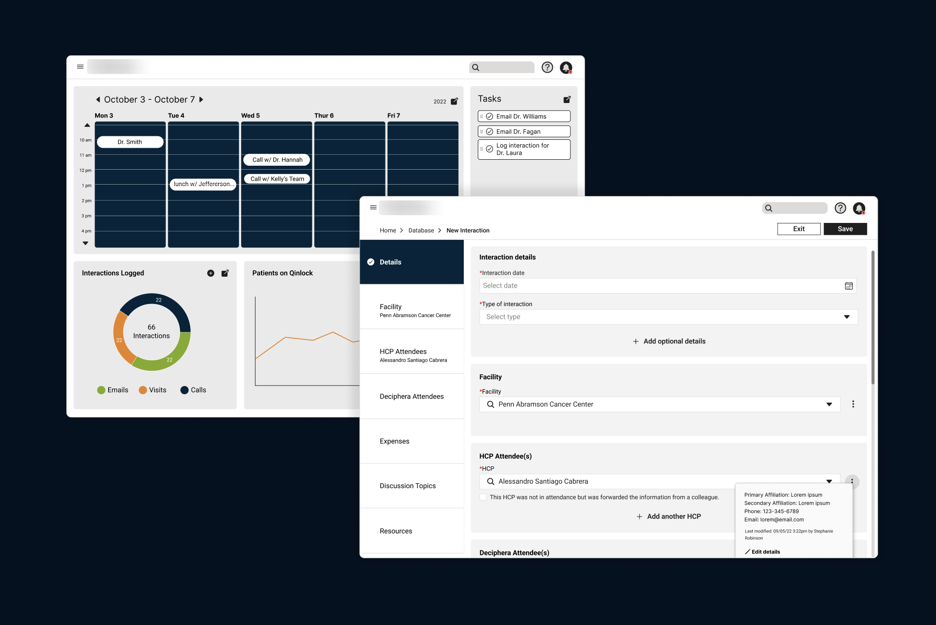
The Deliverable
A registration flow that could be scaled up without sacrificing efficiency
The Deliverable
A registration flow that could be scaled up without sacrificing efficiency
The Users
Account executives and payors
Account executives and payors
Project Details
Team (6): UX designer, UI designer, Design lead, Content strategist, Project manager, Tech lead
Role: UX designer and researcher
Feature Timeline: 1 month
Main tools: Figma, Figjam
Team (6): UX designer, UI designer, Design lead, Content strategist, Project manager, Tech lead
Role: UX designer and researcher
Feature Timeline: 1 month
Main tools: Figma, Figjam
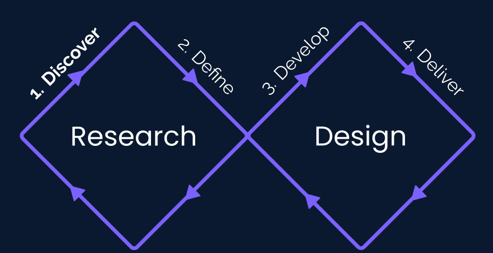
Discovery Goal
Analyze how the current design works and review research to gain better knowledge of the feature and its history.
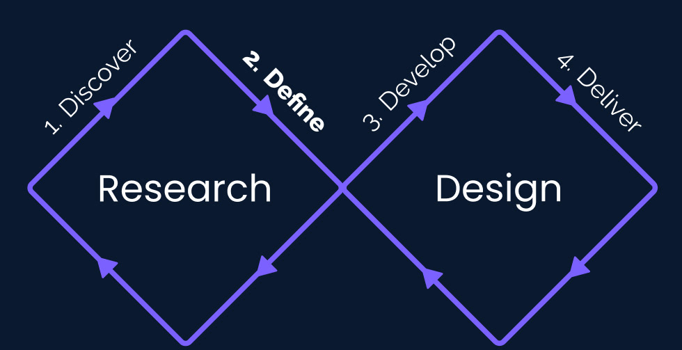
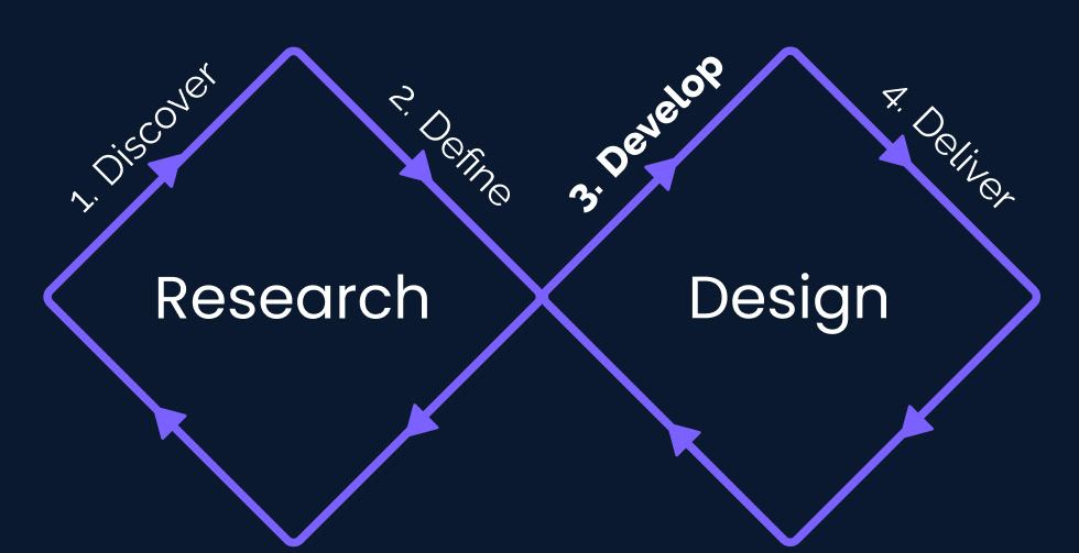
Overarching Process
Gain an understanding of the problem being solved by reviewing research
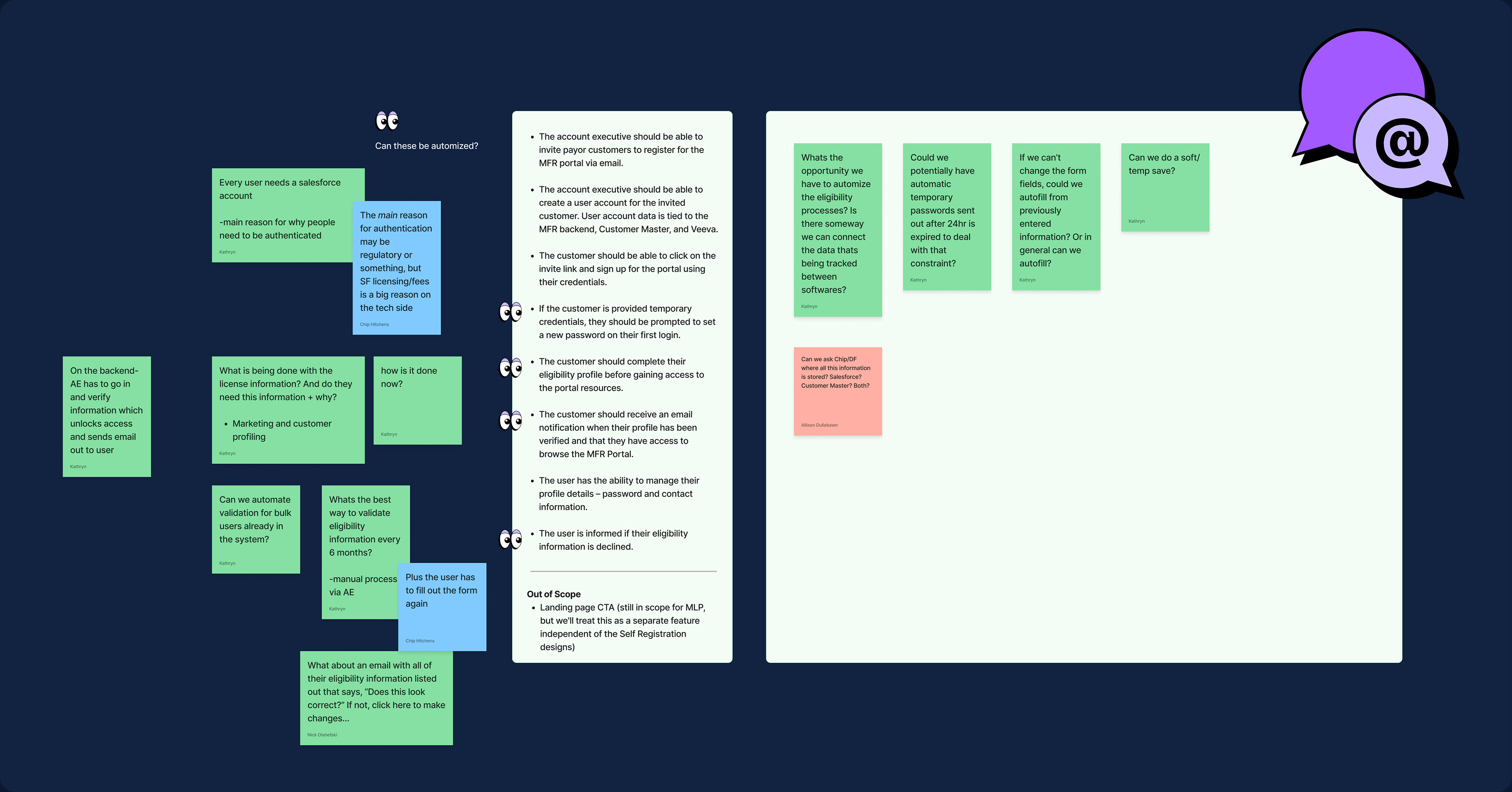
Map all flows and document questions (red stickies) and comments (yellow stickies)
Perform a content strategy analyses to determine what fields were the most important, which fields were extraneous and label what needed to be included from a legal perspective.
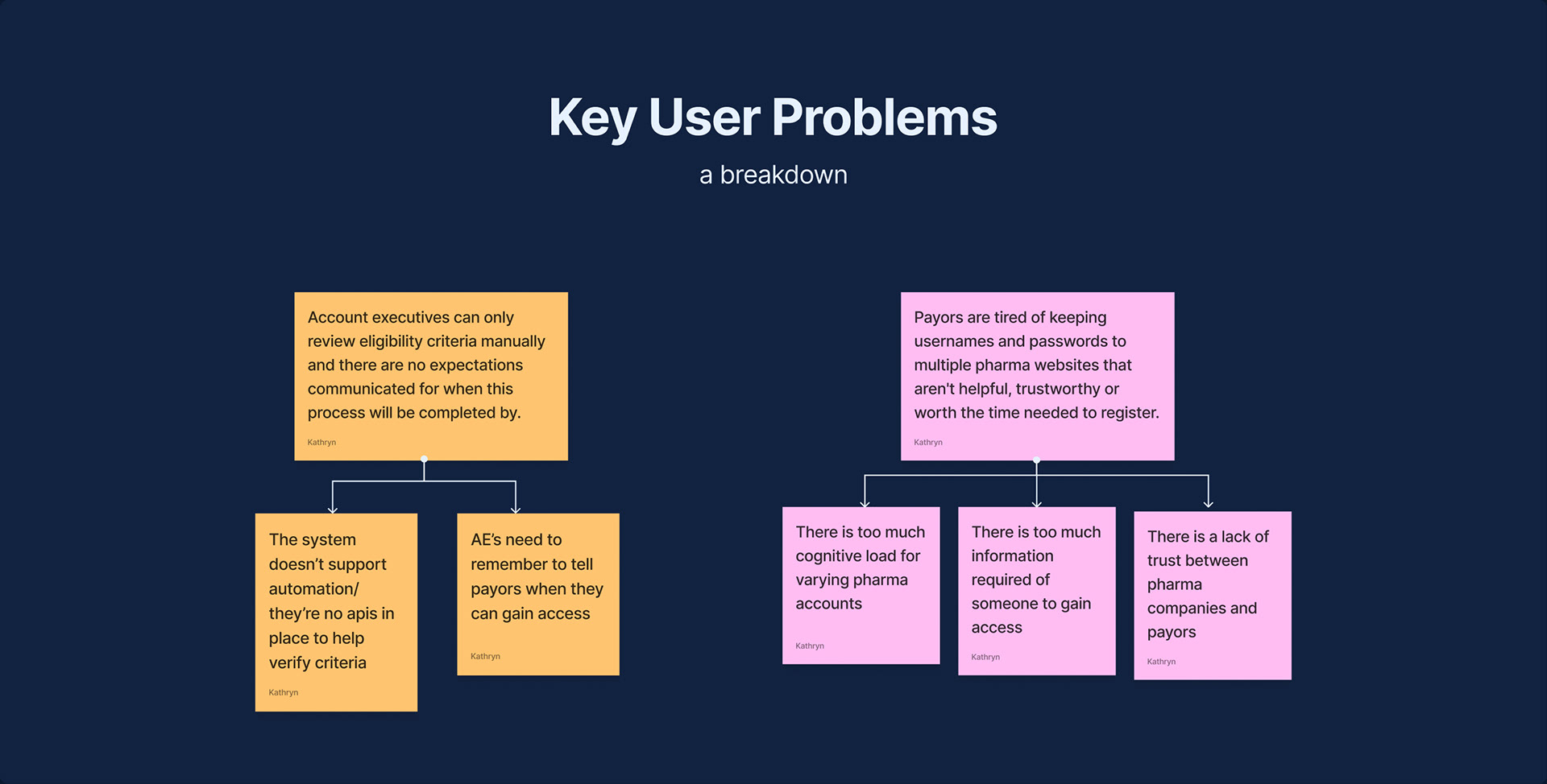
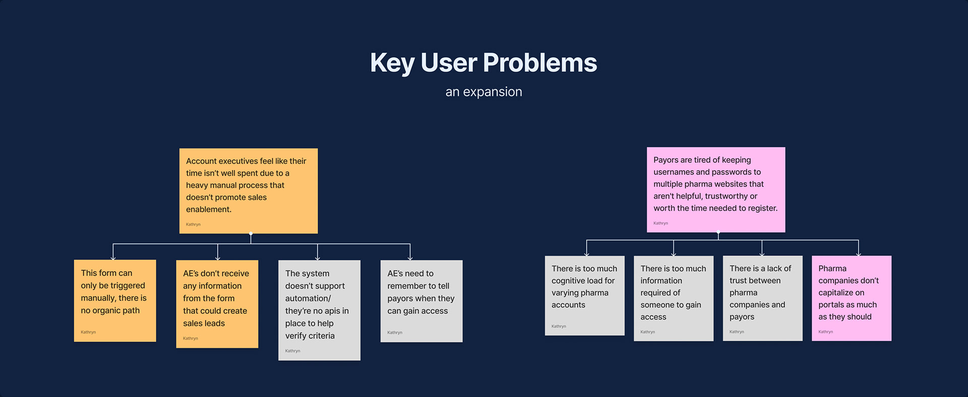
The original problems found in the research
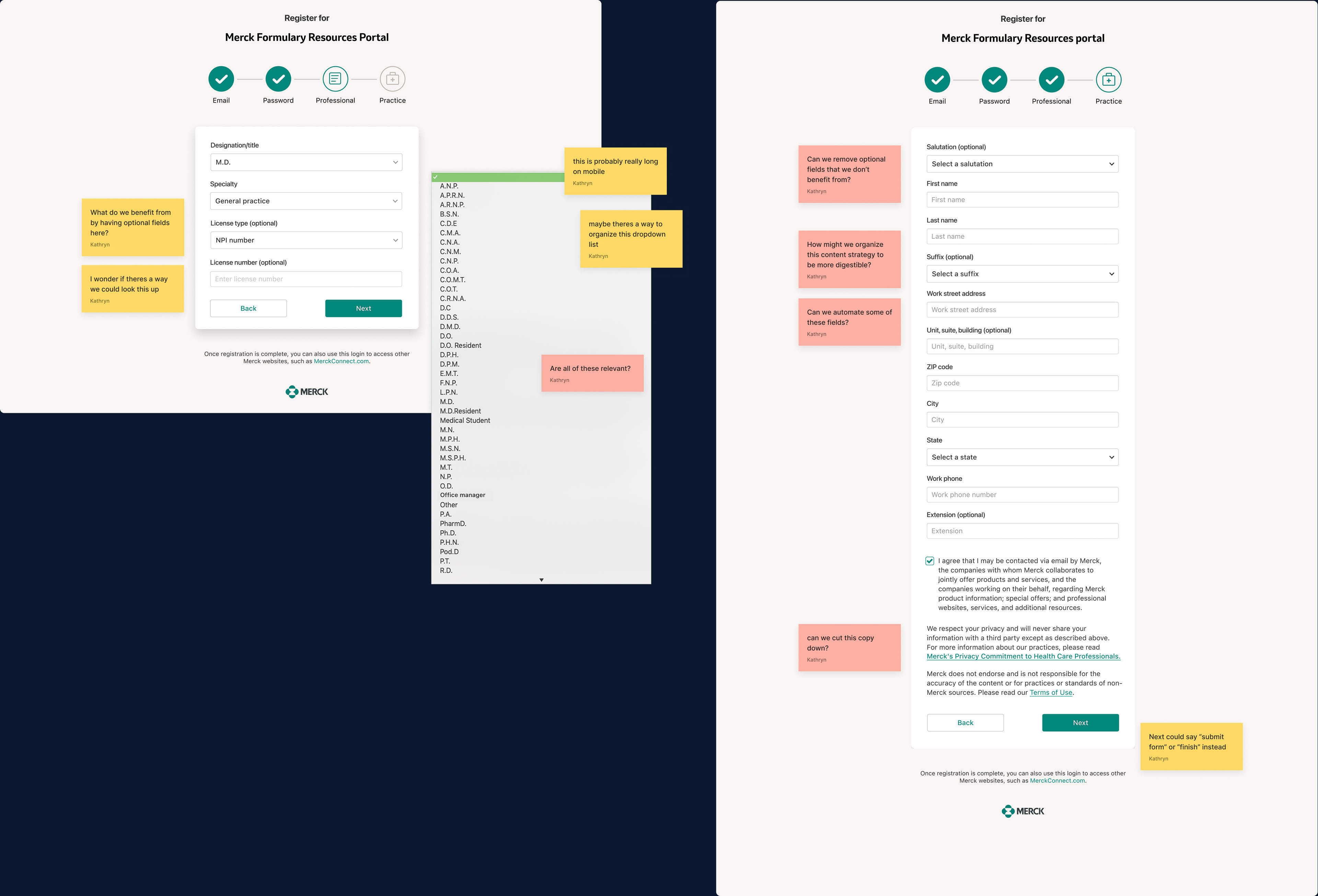
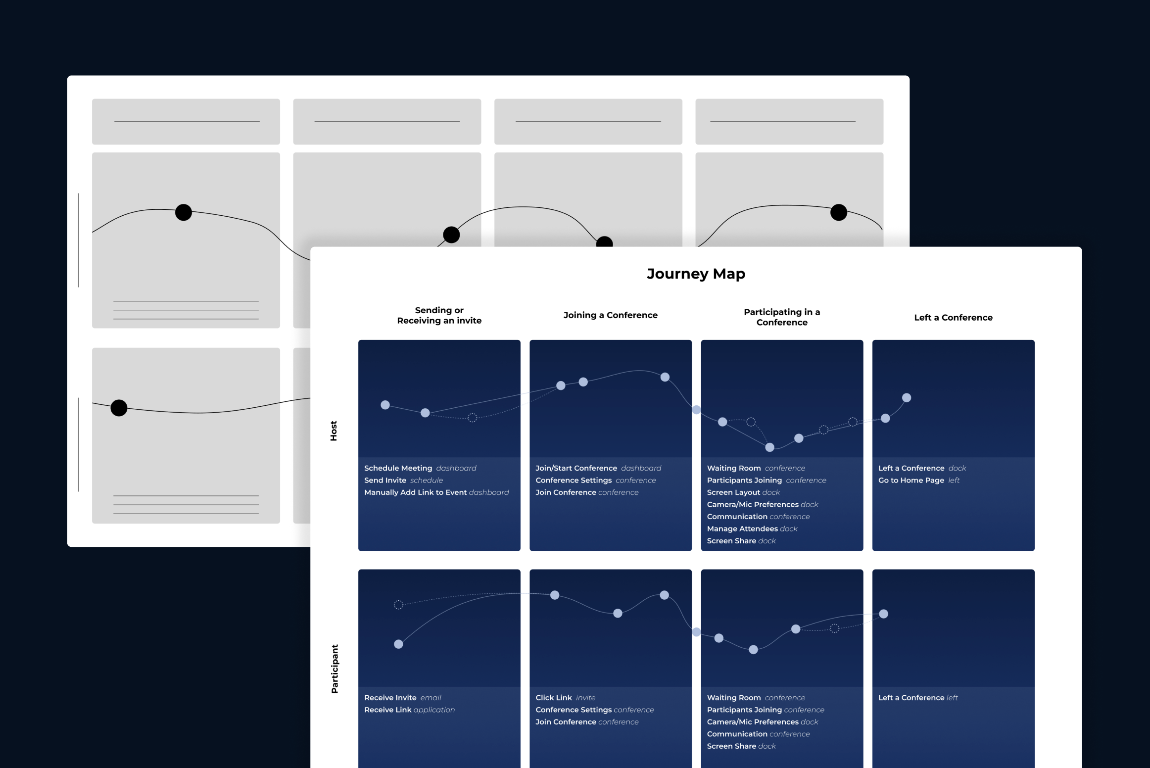
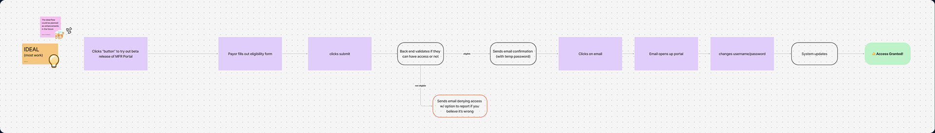
Partial map of login flow
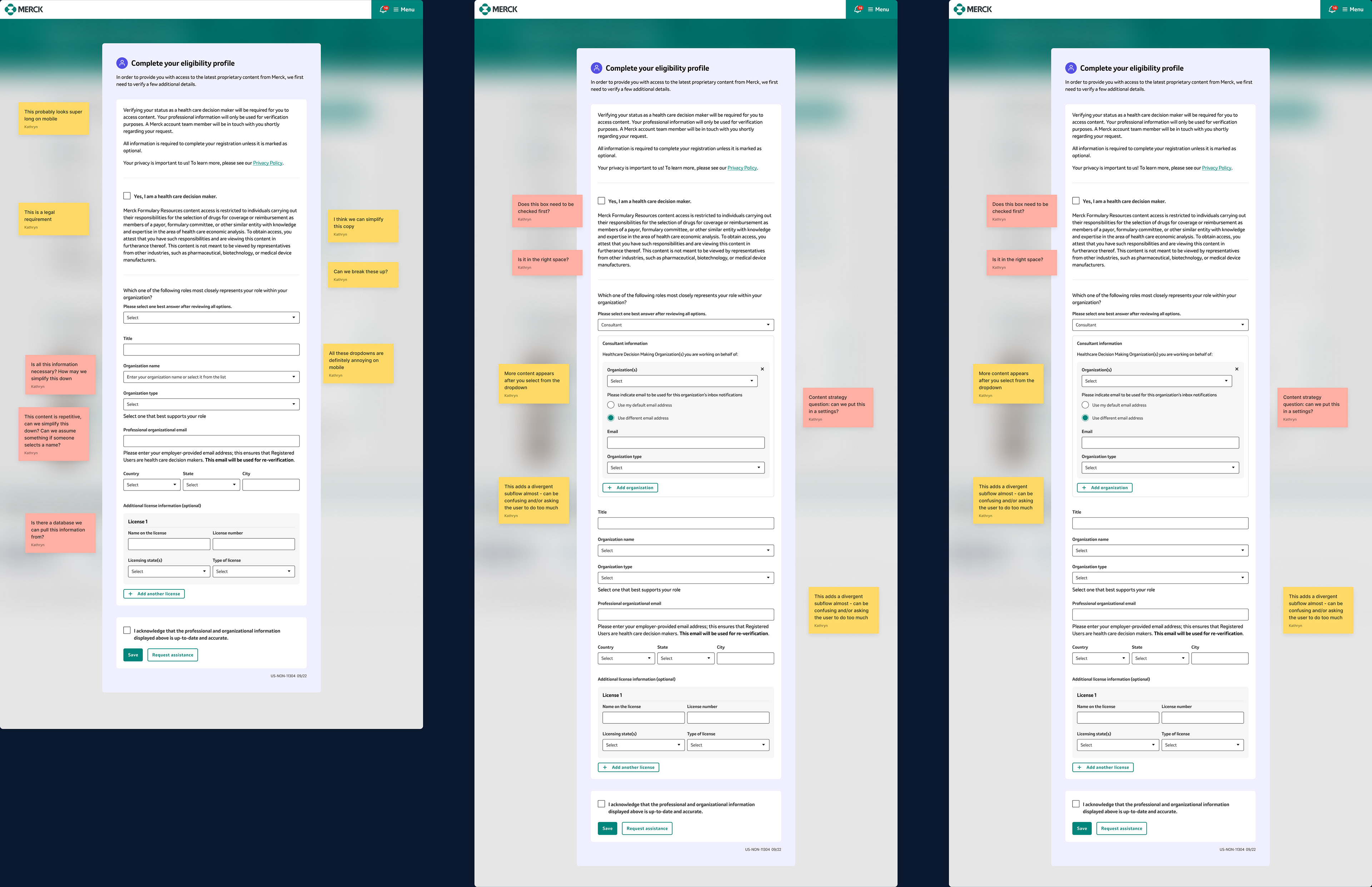
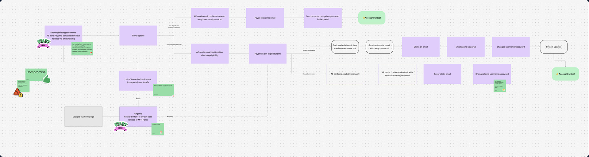
Partial map of eligibility flow
Initial Flow Analyses
For the payor, the flow seemed complex with a high barrier for completion. The login flow had 5 steps with a total of 21 form fields (only 6 being optional). Whereas the eligibility form had anywhere from 12 to 15 fields depending on the information that was input (with only 2 fields being optional). To gain initial access, the payor had to complete both flows
For the account executive, the flow required a lot of manual work and didn't support communication between parties. Once payors completed their form, the account executives had to review all the information and manually check it against multiple sources to verify that it was correct. There was no way for the system to set expectations for when payors would gain access to the resources they needed.
For the account executive, the flow required a lot of manual work and didn't support communication between parties. Once payors completed their form, the account executives had to review all the information and manually check it against multiple sources to verify that it was correct. There was no way for the system to set expectations for when payors would gain access to the resources they needed.
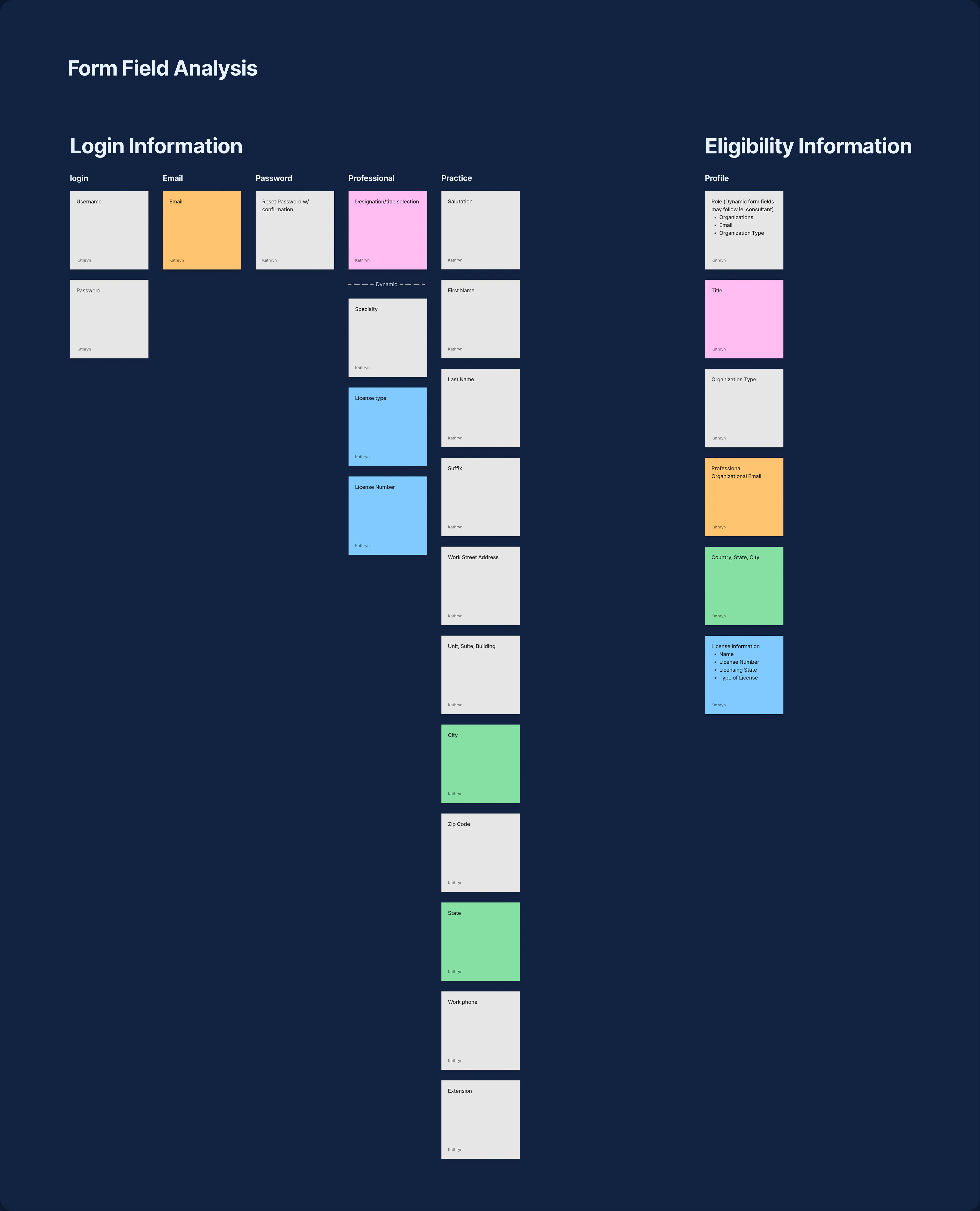
Tracking existing form fields
Form Observations
The information architecture needed to be restructured. There were multiple, redundant steps that required the user to type in either the same or very similar information. Fields were organized into sections that didn't seem share a similar theme.
Initial Understanding
It seemed like both the content strategy and the flow were counterintuitive to the original problem. It felt like more could be done to simplify the form fields and restructure the content to support an easier system for both the payor and the account executive.
Define Goal
Locate specific challenges, strengths and opportunities for growth. Check these against the original problem to validate the need.
Overarching Process
Create potential flows with ideas for initial improvements
Locate strengths and weaknesses to document what to scale and/or adapt
Validate assumptions via a workshop with available users

Potential flow 1
Potential flow 2
Potential flow 3
Potential Flows
Mapping out potential flows is a great way to check for missing information, to validate what is already known and begin to think out what can be designed. After checking with the design team, we decided that the best compromise in terms of level of effort and growth was potential flow #3. This flow was shorter with reorganized content structure and helped to improve communication between the account executives and payors.
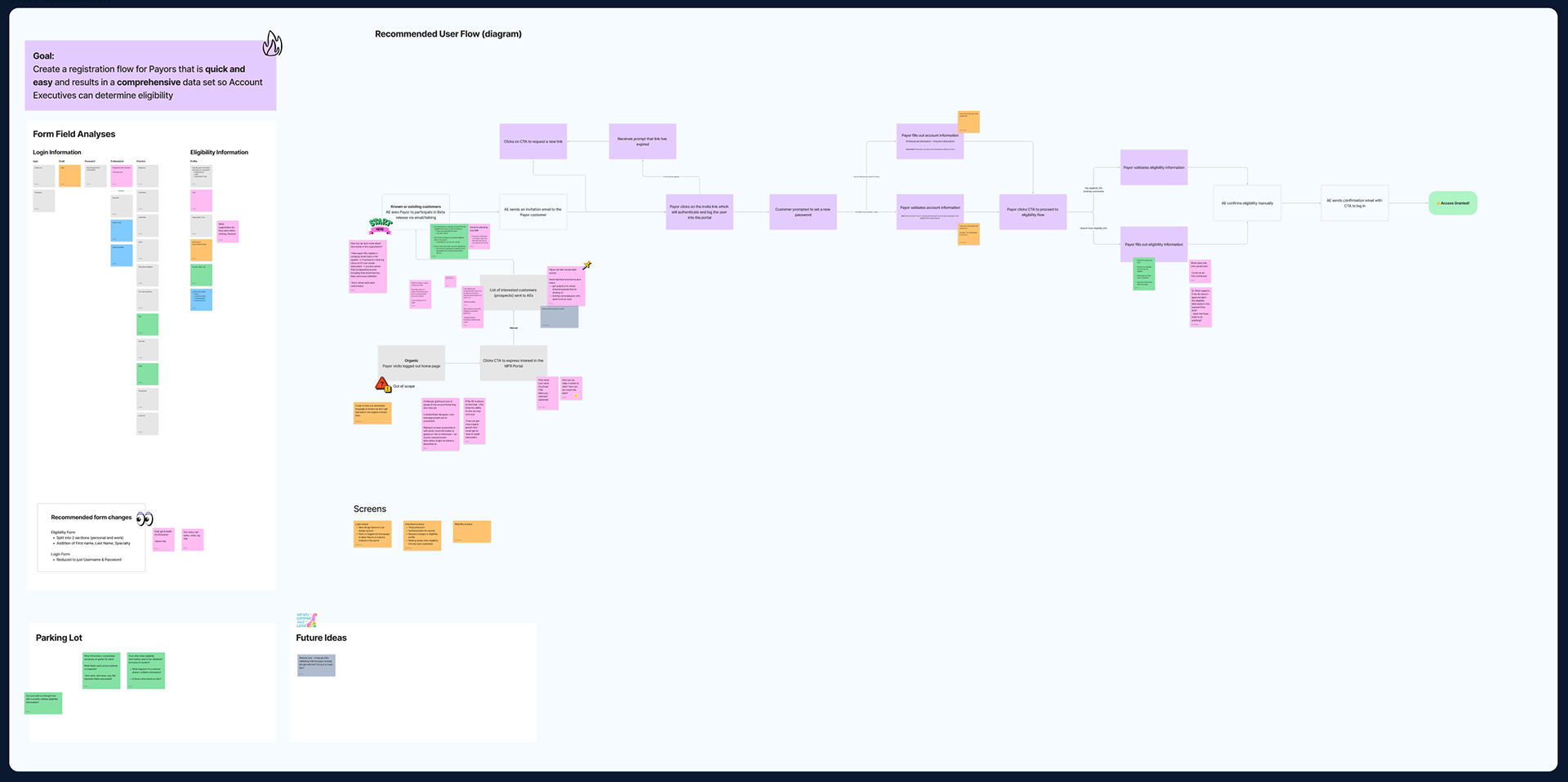
Workshop Board
Updated problems in color
The Workshop
After the workshop, our main design improvements were validated. The participant found the flow streamlined and efficient with a reduced cognitive load. Key changes included adding another flow to approve eligibility for organic traffic and an additional field for tracking referrals for sales enablement and lead generation.
Develop Goal
Maintain alignment between designs and project roadmap, incorporate learnings from research, communicate with developers as well as stakeholders.
Overarching Process
Align and check requirements between management, design and development
Map anything missed and wireframe all flows and
Meet with stakeholders to receive feedback and ensure alignment
Documentation of requirements and dev questions
Aligning on Requirements
Since the workshop revealed the need for an additional flow, I wanted to document information between project management, design and development teams. It helped to track what knowledge was known, what was missing and created a space for general accountability.
Documentation of eligibility flow
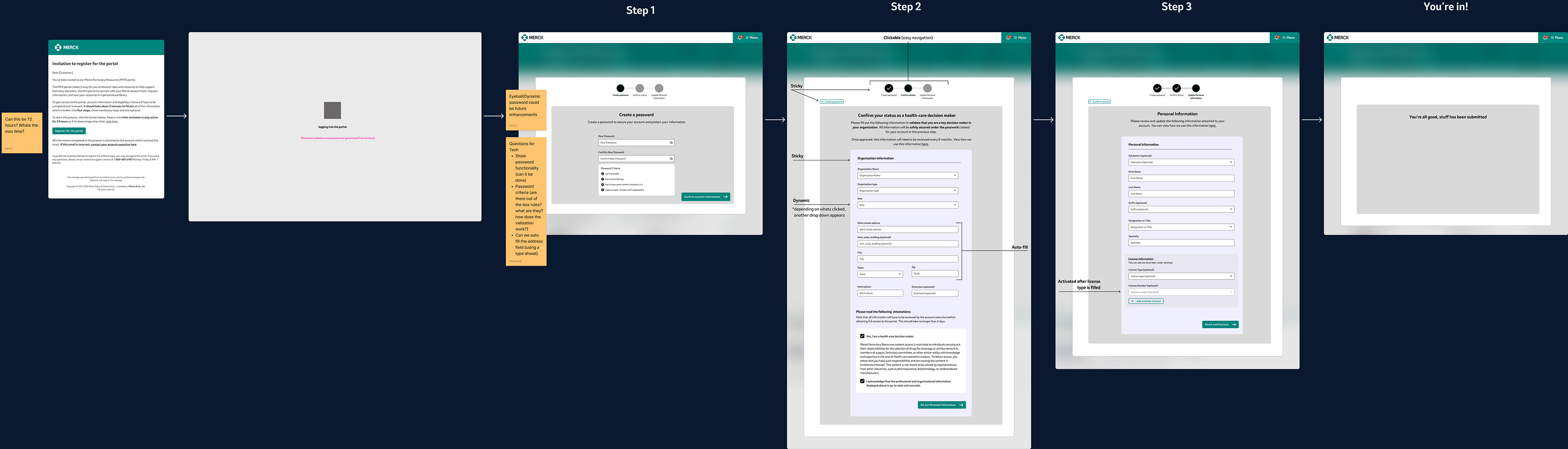
Flow #1: The Manual Experience
This was the primary flow that stakeholders thought customers we're going to move through. These wireframes contained the improvements confirmed in the workshop and were designed for a goal of a faster experience.
This goal was designed for by excluding unnecessary and/or extraneous fields and by adding UI elements that let the user know where they were and what they could expect from the experience (ie. their account executive would reach out to them in 2 business days).
Documentation of organic traffic flow
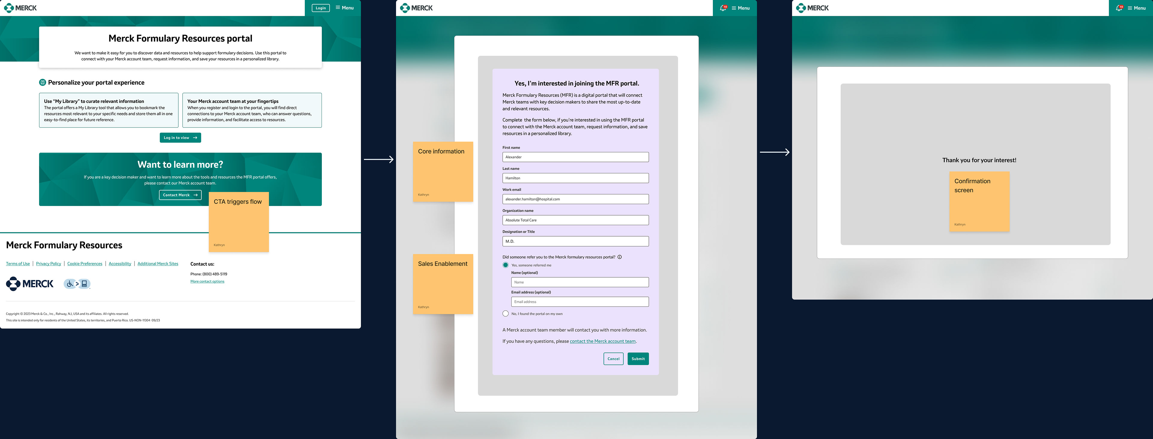
Flow #2: Organic Traffic
This secondary flow that was added after the workshop was mainly for the sales team. This experience was activated on the landing page, needed to be short and provide core information for the account executive.
This goal was achieved by including the referral field and basic professional information as deemed necessary by the workshop.

Deliver Goal
Add any necessary UX changes to the design and collaborate with the UI designer for development documentation.
Overarching Process
Refine the UX
Collaborate closely with the development team and other stakeholders
Refinements
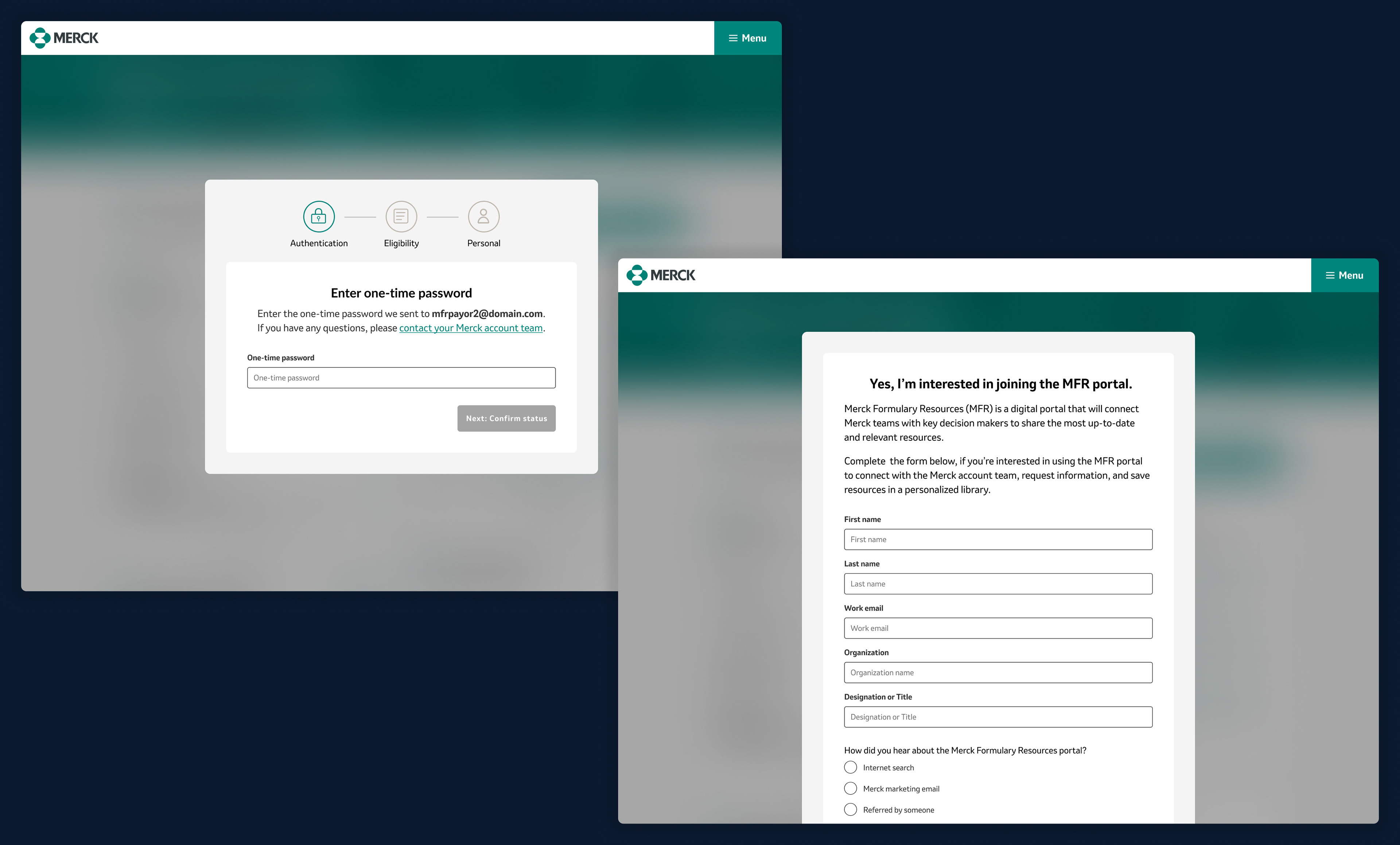
While the organic traffic flow had no enhancements, we were able to replace the create password flow with a one time password screen. We also added additional radios were for the sales team.

Reflections & Challenges
Legal Constraints
Legal reviews could add anywhere from 1-3 months on the project timeline and were required if any language changed on any form. As a result we had to be very careful about maintaining the exact same headers on design elements including form fields and radio buttons. While we were able to delete redundant or extraneous fields, we could've further enhanced reading comprehension and information architecture if we had more time for legal review.
Legal reviews could add anywhere from 1-3 months on the project timeline and were required if any language changed on any form. As a result we had to be very careful about maintaining the exact same headers on design elements including form fields and radio buttons. While we were able to delete redundant or extraneous fields, we could've further enhanced reading comprehension and information architecture if we had more time for legal review.
Add Validation Sessions
It would be ideal if we were able to confirm the experience from the payor perspective with feedback sessions and design validation. Adding user research sessions would've ensured that we were creating a better experience for all users, lead to a more well-rounded design process and increase our knowledge of competitive advantage.
It would be ideal if we were able to confirm the experience from the payor perspective with feedback sessions and design validation. Adding user research sessions would've ensured that we were creating a better experience for all users, lead to a more well-rounded design process and increase our knowledge of competitive advantage.